
Chandrayan is a hand-rolled incense and dhoop brand — Mysore Sandal, Nag Champa, Oudh, Chandan Kesar, Loban, camphor — sold direct to consumers, with ten percent of every order supporting children’s healthcare.
My scope here was website graphics and digital visual design: hero and banner artwork, supporting illustration, promotional graphics, section assets and typographic composition. This is an art-direction case study rather than a product-UX one, and the decisions are recorded as such.
The category problem is specific. Incense is sold almost everywhere on price and packet count, photographed flat against white, in listings that look like hardware. But nobody buys incense for a specification. They buy it for a ritual, a memory, and a smell they already know — which is a visual problem before it is a commercial one.
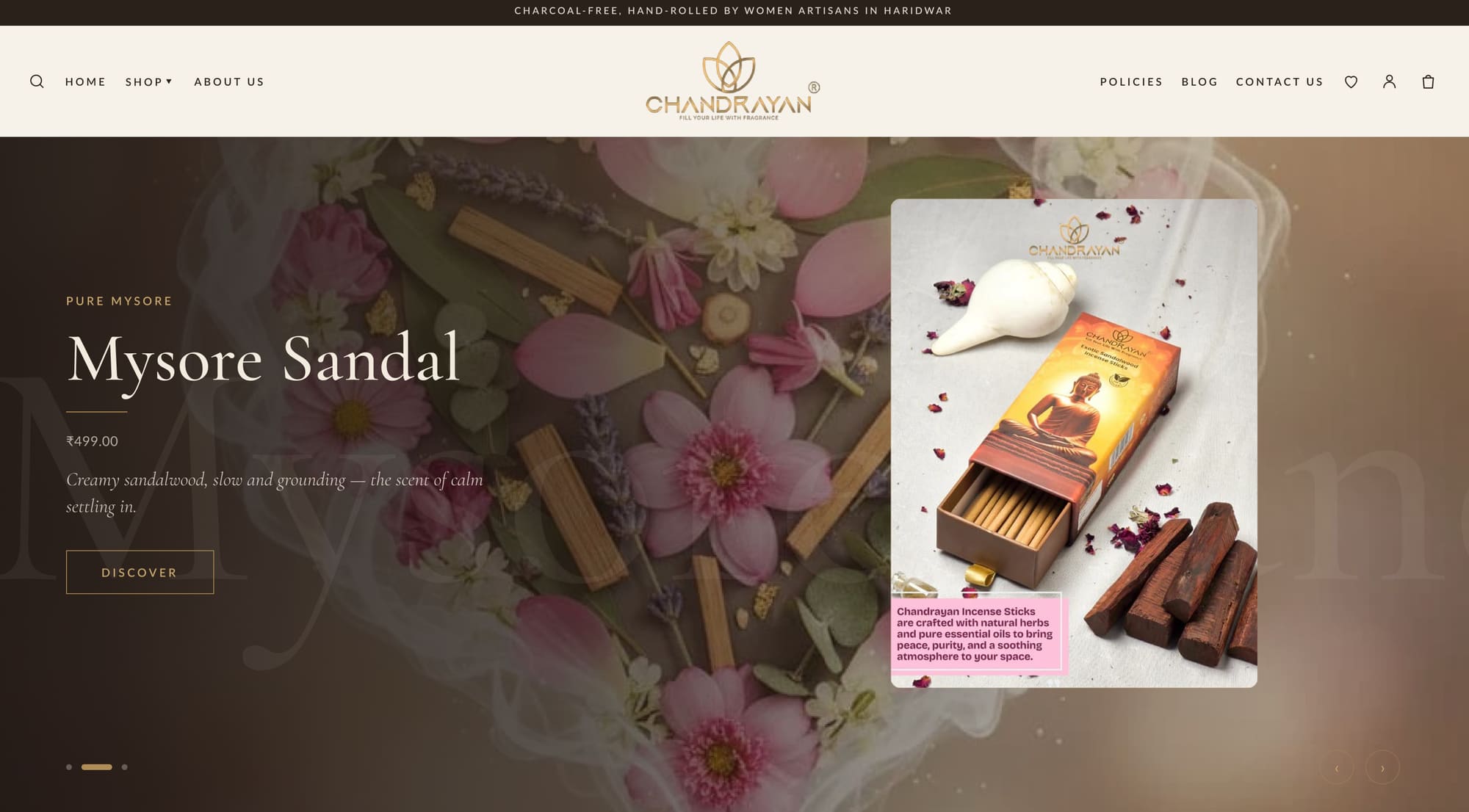
Home hero — craft photography behind a dark scrim, a ghosted oversized wordmark, and the packshot floated as a card so one frame carries both mood and product.
02The challenge
Sell a smell. The single hardest constraint. The only available proxies are hands, materials, smoke, light and language.
Two jobs in one frame. The hero has to establish a mood and show a specific purchasable product, without becoming either a mood board or a catalogue tile.
Nine-plus SKUs on one visual system. Each fragrance needs its own character while the brand stays instantly recognisable across a collection grid.
A real ethical commitment that must not read as a badge. Ten percent of every order goes to children’s healthcare — genuine, and easily cheapened by the wrong treatment.
You cannot photograph a fragrance. You can photograph the twenty minutes before it exists.
03The visual system
Typography
AaCormorant Garamond
Cormorant Garamond
Fragrance names, section titles and product descriptions. A high-contrast Garamond with very fine hairlines — it needs to be set large to survive, which is exactly the discipline the layout wanted. At 56 px and above it gives the brand an apothecary register that no sans could carry; below 20 px it is never used.
400 / 500 / 600≥ 20px onlyitalic for descriptions
AaLato
Lato
Everything functional — prices, buttons, navigation, cart, shipping copy, form labels. Humanist enough to sit beside a Garamond without clashing, neutral enough to disappear when a customer is checking a delivery estimate.
400 / 700uppercase + tracking for UI14–16px body
Palette
Bark#2A211BScrims, footer, dark grounds
Gold#C9A86DLogo, rules, small caps, outlines
Cream#F7F2E9Page ground, cards
Ash#8C8C8CSecondary text, meta
Ink#151210Body text on cream
Gold as ink, never as fill
Gold at full fill reads cheap on screen — it becomes yellow. Restricted to hairline rules, small-caps eyebrows, button outlines and the mark itself, the same colour reads as foil. This single rule does more for the brand’s perceived tier than any other decision in the system.
The full home page — collection grid, bestsellers, essence, featured product, purpose section, testimonials and journal, all built on one banner grid.
04Art direction decision records
The visual decisions, with the reasoning and the cost.
AD-01
Process photography instead of product-on-white
Context
Incense listings everywhere are shot flat on white, which communicates price and nothing else.
Decision
Hero and banner artwork is built on close, warm photography of the making — hands, mortar, raw resin, powder, unfinished cones.
Rationale
Provenance is the only credible substitute for smell. Hands and raw material tell a customer this was rolled rather than machined, which is precisely what justifies the price difference against a supermarket packet.
Trade-off accepted
Process photography is slow, expensive and hard to re-shoot consistently as the range grows; white-background product shots would have been infinitely reusable.
AD-02
A ghosted oversized wordmark behind the headline
Context
The hero needed depth and fragrance-name recall without adding a second image or a graphic device.
Decision
The fragrance name is repeated at enormous scale in low-opacity cream behind the headline, cropped by the frame.
Rationale
It doubles the impression of the name at no cost in space, adds a second depth plane between photograph and text, and gives every hero in the rotation an identical structural signature.
Trade-off accepted
It only works over a busy photograph — on a plain ground it reads as an accident, so hero imagery is now constrained to textured scenes.
AD-03
The packshot floated as a card over the photograph
Context
One frame had to carry both the mood and a specific buyable product.
Decision
A clean product card is composited over the atmospheric photograph, with its own light and a hard edge.
Rationale
It separates the two jobs into two visual layers rather than compromising both into one. The customer gets the feeling from the background and the fact from the foreground, and the eye can move between them.
Trade-off accepted
The composite must be rebuilt for every fragrance and every breakpoint; a single flat image would have been trivially responsive.
AD-04
One banner grid for every seasonal execution
Context
Festival and seasonal artwork changes constantly, and re-laying out the page each time is where brands lose consistency.
Decision
All hero and collection banners are built on a single grid — eyebrow, name, rule, price, description, action, with fixed safe areas for the packshot.
Rationale
Seasonal art can be swapped without touching layout, so a Diwali execution and a regular week are recognisably the same brand. It also lets non-designers produce compliant artwork from a template.
Trade-off accepted
It constrains genuinely creative one-off campaigns, which now have to argue their way out of the grid rather than into it.
AD-05
The purpose commitment in the announcement bar
Context
Ten percent of every order supports children’s healthcare — real, and the sort of thing that dies in a footer.
Decision
It runs in the top announcement bar, set in tracked small caps, above the navigation on every page.
Rationale
The announcement bar is the only element guaranteed an impression on every visit. Stating the commitment plainly, in the same typographic register as the rest of the interface, keeps it a fact rather than a badge.
Trade-off accepted
It occupies the slot most brands use for discount messaging, so promotional urgency has to be carried by the offer modal instead.
AD-06
Fragrance-led collection tiles rather than packet shots
Context
A grid of nine similar boxes is indistinguishable at thumbnail size.
Decision
Each collection tile leads with its material — sandal shavings, champa flowers, oudh chips, kesar threads — with the packet secondary.
Rationale
Material is distinguishable at 200 px in a way that near-identical packaging is not, and it teaches the range by ingredient, which is how customers actually describe what they want.
Trade-off accepted
Requires an ingredient shoot per SKU, and new fragrances cannot launch until their material photography exists.
AD-07
The offer modal styled in-brand
Context
Discount pop-ups are usually app defaults — bright, rounded, loud, and instantly recognisable as third-party.
Decision
The signature-order offer is set on bark ground with gold rules, a Cormorant numeral and the same button geometry as the site.
Rationale
An out-of-brand modal undoes the register of the entire page in one impression, and it is the first thing many visitors see. Matching it costs nothing and protects the work behind it.
Trade-off accepted
Requires overriding app defaults and re-checking after every app update — it will drift if nobody owns it.
AD-08
Serif for names, sans for numbers
Context
Prices, delivery estimates and cart states set in a high-contrast Garamond are slower to read and feel precious in the wrong way.
Decision
Cormorant Garamond carries fragrance names and descriptions; Lato carries every price, button, quantity and shipping line.
Rationale
It puts the romance where the decision is emotional and gets out of the way where the decision is practical — which is also where hesitation costs a sale.
Trade-off accepted
Two families to load and a boundary that has to be policed; the temptation to set a price in the serif “just this once” is constant.
05Responsive behaviour
The packshot card moves below the headline rather than beside it. Composited over a portrait crop it covers the hands, which are the whole point of the photograph.
The ghosted wordmark crops harder and drops in opacity. At phone width it competes with the headline instead of sitting behind it.
The collection grid goes to two columns, never one. A single column loses the comparison between fragrances that makes the ingredient-led tiles work.
The announcement bar keeps full text and wraps to two lines. Truncating the purpose commitment to fit would defeat the reason it is there.
06Outcome
A cohesive visual language across every section of the website, from hero artwork to collection tiles to journal cards.
Graphics that complement the interface rather than competing with it — the brief’s original ask, and the reason gold is restricted to ink weight.
A banner system that lets seasonal and festival artwork be produced from a template without a redesign.
A typographic split that lets the brand feel expensive where it should and frictionless where it must.
Scope and attribution: my contribution was website graphics and digital visual design — hero and banner artwork, supporting illustration, promotional graphics, section assets and typographic composition. Store build, product photography direction and copy were produced with the Chandrayan team. Screenshots captured from the live site, August 2026.
07What I would do next
Build the ingredient photography library properly, so a new fragrance can launch on the same visual system the day it is ready.
Design a fragrance-family navigation — woody, floral, resinous — since that is how customers describe what they want and the current grid does not support it.
Art-direct the packaging and the site as one system; the packet currently does less work in the frame than it could.
Test the hero composite against a single flat image on mobile. The layered version is better on desktop, and unproven on the device most of the traffic uses.