ishitaRajput
I design the screens people use under pressure — a hospital shift dashboard, a clinical record, a D2C fragrance brand finding its visual identity. I study computer science, so I can read the data model an interface sits on and argue with it.
i consumeeverythingfirst
designing since 2024, alongside a computer science degree. a twelve-module hospital management system, two healthtech websites, web graphics for a d2c fragrance brand, and the visual system for the literary society i was vice-president of.
- since 2024
- designing
- 04
- ui·ux case studies
- 03
- live sites shipped
- 02
- visual identity systems
- design contractor — techfrien healthcare solutions [Apr 2026 – Jun 2026]techfrien.com
- ui/ux design intern — olinp technologies [Feb 2026 – Apr 2026]cognitomeprogram.me
- ui/ux design intern — vinkura [Oct 2025 – Feb 2026]vinkura.in
- graphic designer — zeepty [May 2025 – Aug 2025]brand & campaign
the workhappensin the dark
- 01
discover
user research, stakeholder discussions, competitive audits and problem definition.
- 02
structure
information architecture, mental models, user journeys and low fidelity wireframes.
- 03
synthesize
design system architecture, components, typography, colour, spacing and interaction patterns.
- 04
craft
high fidelity ui, responsive layouts, accessible interaction models and prototypes.
- 05
deliver
developer handoff, design qa, feedback cycles and continuous optimisation.
what iactually do
ui/ux & interaction
- user research and ux strategy
- information architecture
- design systems and components
- rapid prototyping
craft and delivery
- responsive web design
- interaction design
- usability testing
- accessibility focused design
ux writing & content design
- microcopy
- error states
- empty states
- form labels
tools
- figma · figjam · tokens studio · maze
- illustrator · photoshop
- html · css · python · sql
wings arepumped fullbefore they hold
four product systems, two graphic identities. each one opened all the way up.
techfrien
the site that sells medara hmis to hospital procurement committees. thirteen colour tokens, three type roles, an faq written as procurement objections — and no blue anywhere, in a category that is entirely blue.
nine documented decisions, one live site
read the case →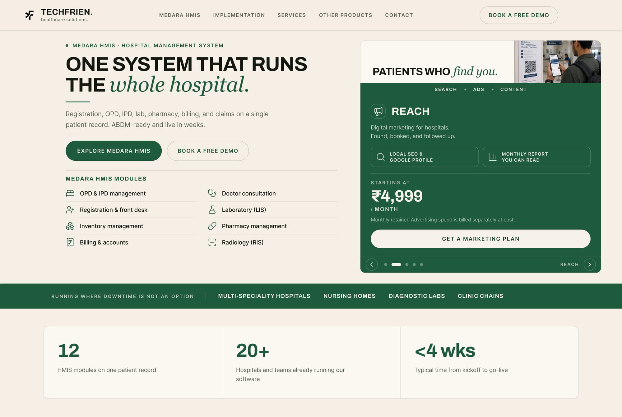
cognitome
cognitive wellness programme redesign. stronger information hierarchy, simplified navigation and a calm visual language.
a more approachable user journey
read the case →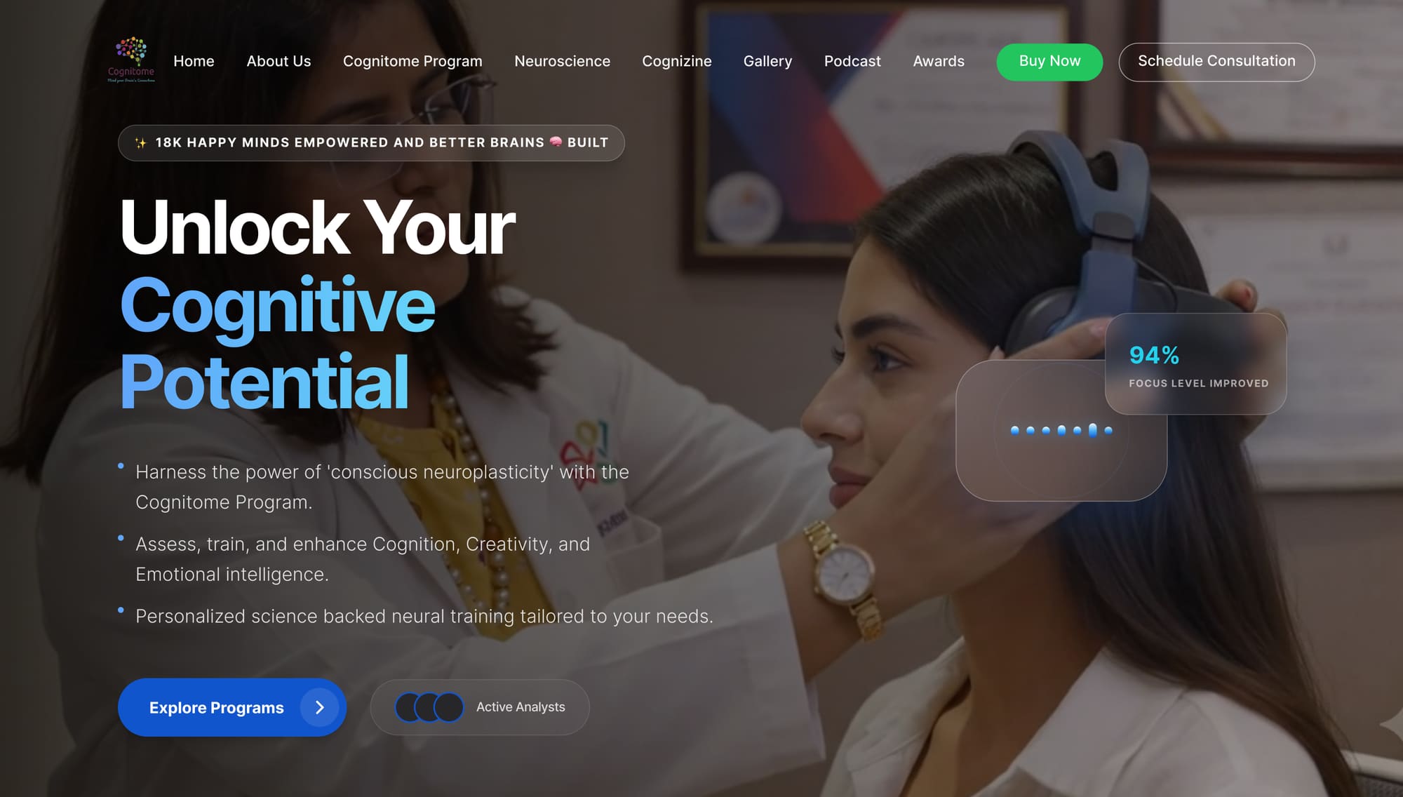
medarahmis
hospital management information system. twelve modules on one patient record, organised around the sequence of a shift rather than the shape of the database.
centralised hospital workflows
read the case →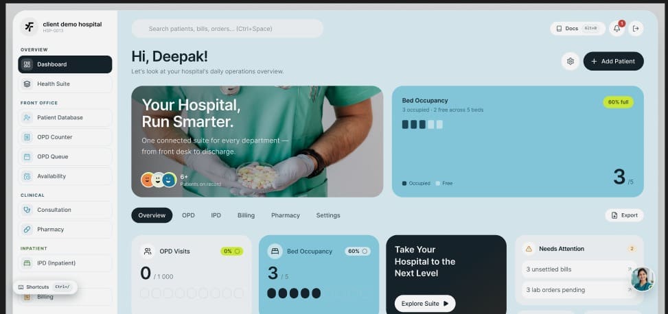
credence
money-first mobile payments concept. a payments app that tells you whether today is fine before it asks what you want to pay. four payment routes, every figure measured against your own usual, eight documented decisions.
61 mobile frames, eight design foundations
read the case →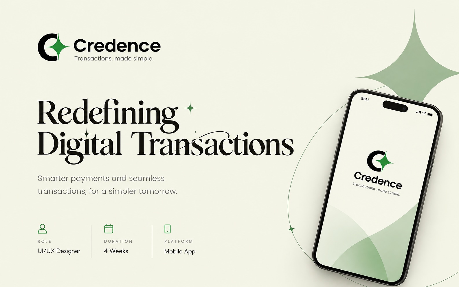
minervaliterary society
a visual system rotating volunteer designers could not break. the type hierarchy is locked, colour and illustration are completely free — so a dozen events a year each get their own world and the feed still reads as one society.
40 px thumbnail to two metre standee
read the case →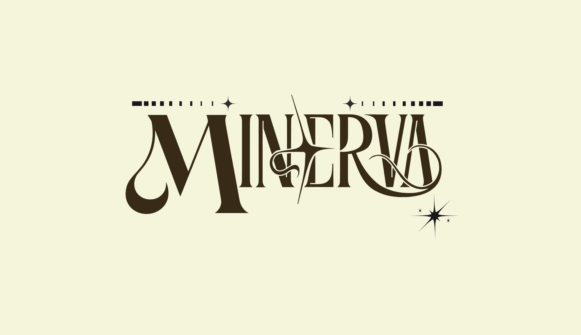
chandrayan
hero and banner graphics for a hand rolled incense brand. you cannot photograph a fragrance, so the work became photographing everything around it.
gold used as ink, never as fill
read the case →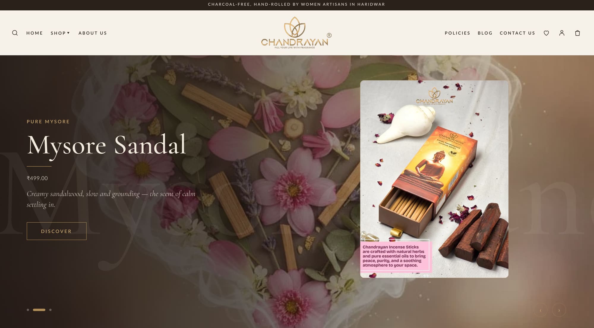


great interfaces begin with understanding people — their needs, their environment, and the friction they hit.
a design system creates consistency. typography, composition and colour give a product its character.
no design is ever finished. prototype, evaluate, iterate, and stay close to the people shipping it.
- product design & ui/uxend to end
- healthtech & clinical interfacesinformation dense
- design systemscomponents & tokens
- data-heavy dashboardscs + data science
background