all work
02Cognitome
visit live site ↗
case study · ui/ux · healthtech · website redesign · 2026

Cognitome

Clinically credible and humanly calm at the same time — a redesign that is mostly an argument about pacing.

Problem
Clinical cognitive health evidence existed in dense unbroken paragraphs that anxious patients and clinicians could not scan or self-qualify through.
My role
UX audit, IA restructure, design system tokens, and high-fidelity UI; clinical content & code with the Cognitome team.
Timeline
Feb 2026 – Apr 2026 · 8 weeks
Outcome
Reorganised nine destinations by user life-stage priority with persistent multi-channel conversion.

01Context

Cognitome is a cognitive wellness programme — assessment, neural training and rehabilitation delivered through a clinical practice, with a client portal, a magazine, a podcast and a programme catalogue behind it.

Health content carries a contradiction most categories do not. It has to be credible, which pulls towards density, evidence, citation and clinical restraint. And it has to be reassuring, because the person reading it is often anxious about themselves or a parent. Push too far towards credibility and it reads as a journal nobody finishes. Push too far towards reassurance and it reads as marketing — which, in health, is read as evasion.

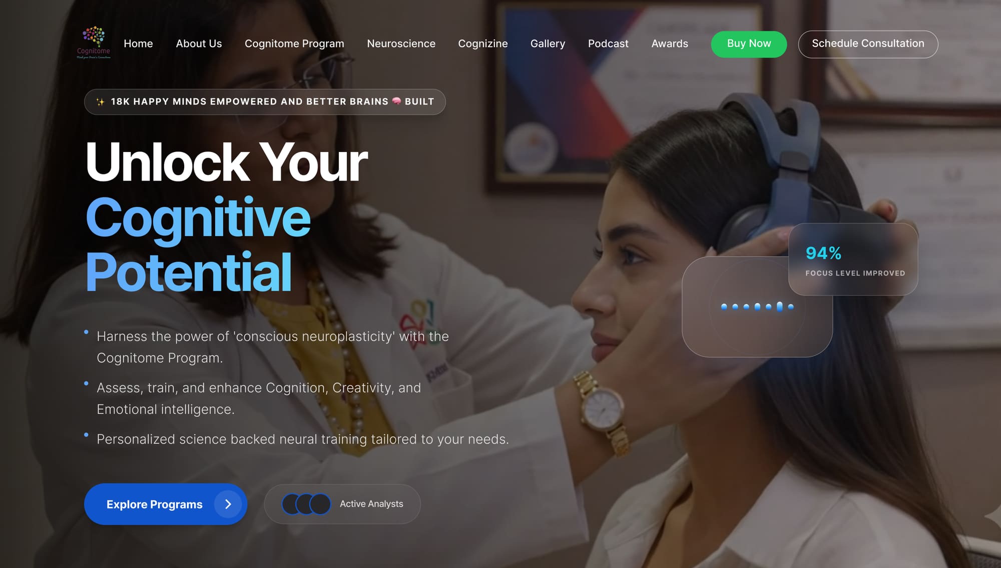
Home — real clinical photography, a three-tone headline gradient, glass stat cards floated over the image, and a persistent WhatsApp channel.

02The challenge

In health, trust is not a visual style. It is the order the information arrives in.

The audit of the existing site produced five findings, and everything after followed from them.

  • The programme was described before it was located. Mechanism came before audience, so a visitor could not self-qualify in the first screen.
  • Evidence existed but was unreadable. Real supporting material sat in long unbroken paragraphs, so it read as volume rather than as proof.
  • Everything was weighted equally. No hierarchy meant no reading path; the visitor had to construct one.
  • Conversion points were placed by layout, not by readiness. Calls to action appeared where there was room, sometimes before the visitor had enough information to act.
  • Nothing acknowledged the reader’s emotional state. The copy addressed a researcher; the actual audience is often worried.

03Information architecture

Nine destinations, ordered by the questions a visitor actually asks rather than by the organisation’s internal structure.

HomeRecognition, proposition, evidence, programme overview, outcomes, voices, FAQ.
Cognitome ProgramThe flagship catalogue — cognitive training, cognitive rehabilitation, brain longevity, sleep, peak performance, digital detox.
NeuroscienceThe credibility layer. Modalities named plainly: brain-wave entrainment, neurofeedback and QEEG, HRV biofeedback, transcranial photobiomodulation, AR/VR mindfulness, digital cognitive training, neuromodulation, sensory integration.
About UsPractice, clinicians, mentors and provenance.
CognizineA magazine, and the long-term reason to return before you are ready to enrol.
Podcast · GalleryFormat-diverse proof — voice and place, for readers who trust neither prose nor statistics.
AwardsThird-party validation, given its own destination rather than a logo strip.
ContactConsultation scheduling, with WhatsApp available from every page.
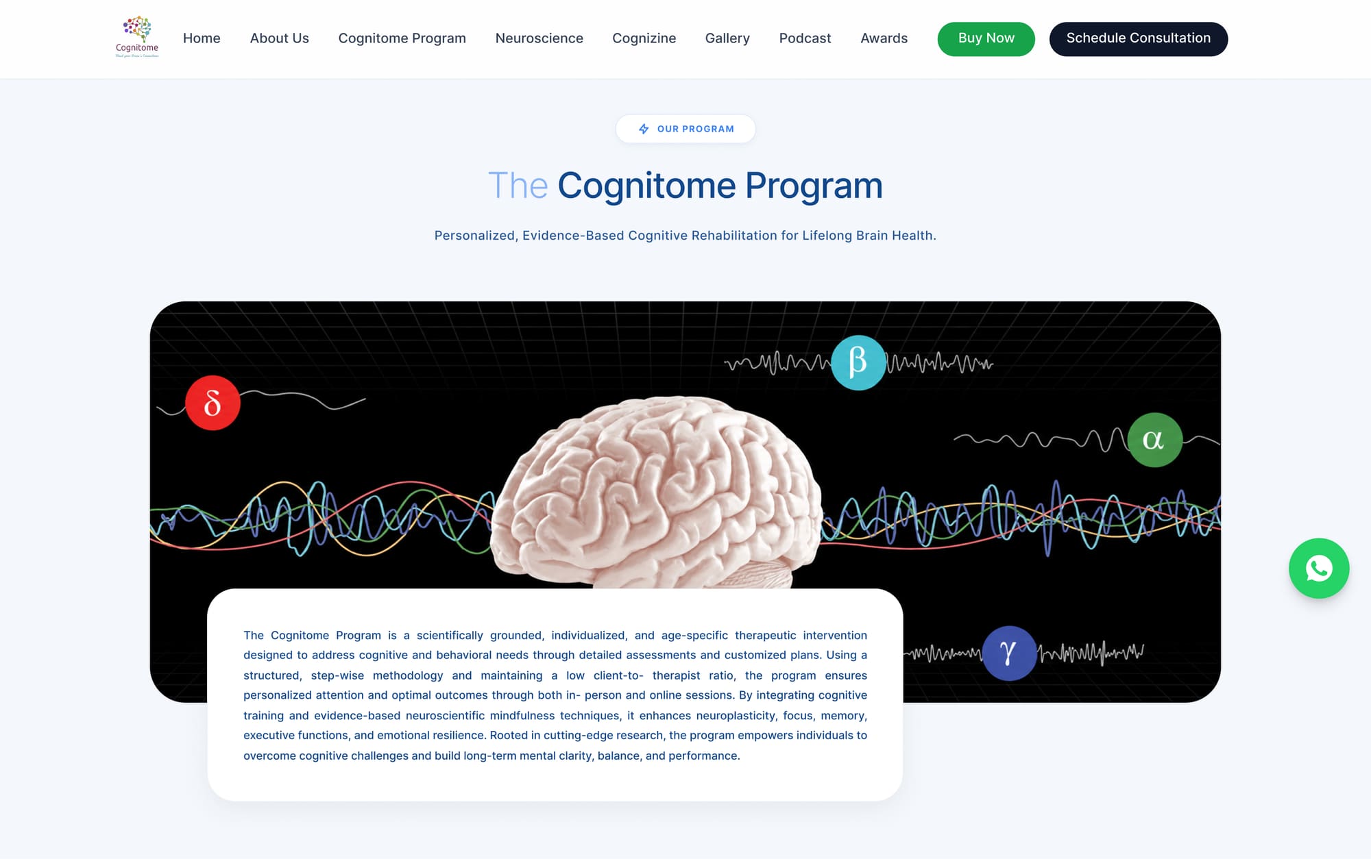
Cognitome Program — the flagship catalogue, where six programmes have to be distinguishable at a glance.

04The design system

Colour

Navy and gold, with a blue scale for interaction. The pairing is the most consequential decision on the project: navy alone reads as generic health-tech, and gold alone reads as luxury spa. Together they read as clinical authority with longevity attached — which is precisely the programme’s positioning.

Navy deep#0A1930Section grounds, gradients
Navy black#040B16Darkest ground, overlays
Navy#0E4483Primary brand, headings on light
Navy mid#11488CPanels, section fills
Gold#D1B075Accent, awards, premium markers
Blue#3B82F6Primary action, links
Blue bright#4DB8FFHeadline gradient, data highlights
Blue soft#89B4F8Headline gradient tail, tints
Tint#DAE8FFCard fills, hover states
Paper#F8FBFFPage ground on light sections

Typography

A single geometric sans across the whole site, worked hard through weight and size rather than through additional families. In a site this content-heavy — nine destinations, six programmes, nine modalities — a second display face would have added noise without adding hierarchy.

AaInter (system sans stack)
Inter (system sans stack)

Everything. Headlines run at 600–700 with tight tracking so a three-line hero reads as a single shape; body sits at 16–18 px with generous leading because health content is read slowly and often by older readers. Modality names — QEEG, HRV, photobiomodulation — are set in medium rather than bold so the technical vocabulary reads as ordinary rather than as a claim.

400 / 500 / 600 / 70018px / 1.7 bodymeasure ≤ 64ch

Surface and depth

  • Glassmorphic panels over photography — translucent, blurred, 1 px light border. Used only where content sits on an image, never on a solid ground.
  • Pill geometry throughout — badges, CTAs, avatar stacks and stat cards all share a fully rounded corner, which is what makes an otherwise dense hero feel calm.
  • Gradient as a directional device, not decoration: the headline runs white to bright blue to soft blue down three lines, so the eye is pulled downward through the proposition.

05Screens

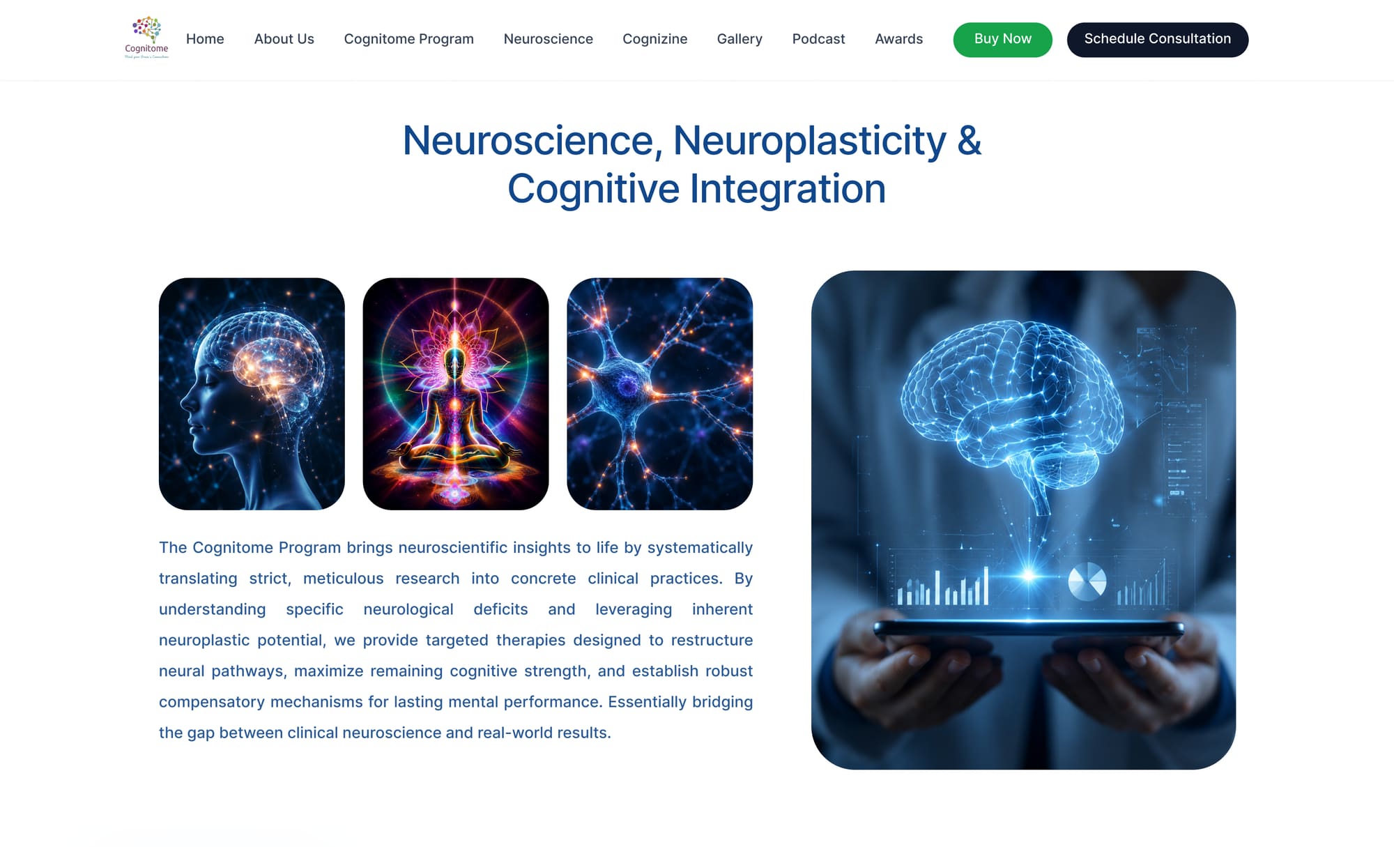
Neuroscience — the credibility layer, where nine modalities have to be explained without becoming a glossary.

The Neuroscience page carries the heaviest lift on the site. Each modality is given a name, a one-line plain-language explanation and a visual, in a repeating unit — so a sceptical reader can scan the vocabulary and a curious one can read the explanation, without either being served the other’s content.

06UI decision records

UI-01

Age-wise service segmentation as a primary cut

Context
A student optimising exam performance and a family managing a parent’s cognitive decline share almost nothing.
Decision
Services are segmented by life stage, with each segment leading to its own programme set.
Rationale
It lets a visitor self-select in one click and prevents the site from writing copy that has to address every audience simultaneously, which is how health copy becomes vague.
Trade-off accepted
Multiplies the content matrix — each programme now needs framing per age segment.
UI-02

A four-pillar mnemonic over a flat programme list

Context
Six flagship programmes and nine modalities do not fit in working memory as a list.
Decision
Everything is organised under four named pillars — ACE, AIM, ADD, ACT — each expanding into programmes and modalities.
Rationale
A four-item structure is recallable after one pass; a fifteen-item list is not. It also gives the practice a language to use in consultations, not just on the website.
Trade-off accepted
Acronyms need decoding on first use, and the pillars must be genuinely distinct or the structure becomes an obstacle rather than an aid.
UI-03

Technical vocabulary exposed early, not hidden

Context
Simplifying the science would have made the programme easier to read and much easier to disbelieve.
Decision
QEEG, HRV biofeedback, transcranial photobiomodulation and neuromodulation are named on the home page and given a destination of their own.
Rationale
Naming the mechanism is what separates a clinical programme from a wellness product. The sceptical reader — often the family member paying — needs the vocabulary to verify.
Trade-off accepted
Raises the reading level of the page and requires every term to carry a plain-language line, which costs vertical space.
UI-04

Content formats as top-level destinations

Context
Most visitors are not ready to enrol on the first visit, and a single blog is a weak reason to return.
Decision
Cognizine, Podcast, Gallery and Awards each get a primary navigation slot.
Rationale
Different people trust different formats — some read, some listen, some need to see the room. Giving each its own destination turns a one-visit decision into a relationship.
Trade-off accepted
Four of the nine navigation slots are spent on content rather than conversion, and each format needs sustained production to stay credible.
UI-05

A persistent WhatsApp channel

Context
In the Indian market WhatsApp is the default channel for a first health enquiry; a contact form is a much higher barrier.
Decision
A floating WhatsApp action is available from every page, alongside the formal consultation booking.
Rationale
It meets the anxious first-time enquirer where they already are, at the moment the question occurs, rather than requiring them to compose an email.
Trade-off accepted
Enquiries arrive outside the CRM unless deliberately integrated, and the floating button occupies the bottom-right corner permanently on mobile.
UI-06

Evidence placed inside the image, not beside it

Context
Outcome figures usually get a grey statistics strip that visitors scroll straight past.
Decision
Floating glass cards — 94% focus level improved — sit over the hero photograph, inside the same visual frame as the clinical scene.
Rationale
Putting the number on the picture ties the claim to the context that makes it credible, and it earns attention at the exact moment a visitor is deciding whether to keep reading.
Trade-off accepted
Glass panels over photography are fragile: they need a minimum blur and a border to stay legible, and they must be repositioned per breakpoint rather than reflowed.
UI-07

Real clinical photography, never abstract brain graphics

Context
The cognitive-wellness category is saturated with glowing neurons, particle networks and abstract head silhouettes.
Decision
Every primary image is a real photograph of the practice — a clinician, a client, an actual device in use.
Rationale
A real room with real equipment is the fastest credibility signal available, and it separates the brand from a category that all uses the same stock library. It also implicitly answers “is this a real clinic or an app?”
Trade-off accepted
Photography must be commissioned and re-shot as the practice changes; stock would have been cheaper and instantly replaceable.
UI-08

Navy paired with gold rather than blue alone

Context
Blue-only health-tech palettes are indistinguishable from one another and read as software rather than as care.
Decision
Deep navy carries structure and authority; gold is reserved for awards, premium programme markers and accents.
Rationale
Navy supplies clinical seriousness, gold supplies longevity and worth. Together they position the programme as a considered long-term investment rather than a subscription.
Trade-off accepted
Gold is a difficult accent for interactive states — it fails contrast at small sizes on light grounds — so a separate blue scale had to carry all interaction, giving the system two accent families to maintain.
UI-09

A three-tone headline gradient across three lines

Context
The hero headline is static and needed a sense of movement matching the promise of progression.
Decision
“Unlock Your / Cognitive / Potential” runs white → #4DB8FF → #89B4F8, one tone per line.
Rationale
It creates downward pull through the proposition without animation, and gives the brand a recognisable headline treatment reusable on every inner page.
Trade-off accepted
The lightest line sits at lower contrast against the photograph, so the scrim behind it has to be tuned per image or the third line goes soft.

07Responsive behaviour

  • Glass stat cards move out of the image and become a row beneath it. Over a cropped photograph on a small screen they cover the subject and lose the context that made them credible.
  • The headline keeps all three lines — the gradient depends on three, so the type scales down rather than reflowing to two.
  • The nine-item navigation collapses to a drawer, but Buy Now and Schedule Consultation stay visible in the bar.
  • Bulleted claims become a stacked list with more leading rather than shrinking, because this is the block most likely to be read on a phone.

08Outcome

  • The programme was described before it was located.
    → The home page now opens on audience, not mechanism. Services are cut by life stage, so a visitor self-qualifies in one click instead of reading to find out whether this is for them.
  • Evidence existed but was unreadable.
    → Supporting material moved out of unbroken paragraphs and into the hero image itself as glass stat cards, and the nine modalities were each given a name, a one-line plain-language explanation and a visual in a repeating unit.
  • Everything was weighted equally.
    → A single type family worked through weight and scale now carries the hierarchy, and the headline gradient runs top-to-bottom across three lines specifically to create a reading path where there was none.
  • Conversion points were placed by layout, not by readiness.
    → Buy Now and Schedule Consultation persist in the bar, and WhatsApp is available from every page — so the action is available at the moment of readiness rather than at the moment the layout had room.
  • Nothing acknowledged the reader’s emotional state.
    → WhatsApp as the first-contact channel, because in this market an anxious first enquiry about a parent is a message, not a contact form.

Still open

Comprehension of the Neuroscience page is untested, and the two accent families are not yet documented tightly enough for another designer to extend. Both are in “what I would do next” and neither is solved.

Scope and attribution: my scope was the UX audit, restructure, design system and high-fidelity UI; clinical content, photography and engineering were produced with the Cognitome team. Screenshots are of the live production site, captured August 2026.

09What I would do next

  • Comprehension-test the Neuroscience page with people outside the category — it is the most likely place for unnoticed jargon.
  • Add a short self-assessment to the audience section, converting passive recognition into an active, memorable moment.
  • Consolidate the two accent families. Gold and blue both currently carry meaning, and the boundary is not yet documented tightly enough for someone else to extend.
  • Build the evidence layer into a standalone citable reference section — good for readers, and the part of the site most likely to be surfaced by AI answer engines.