all work
04Credence
view the prototype ↗
case study · product design · ui/ux · fintech · brand identity · 2026

Credence

Designing a payments app that answers “am I okay today?” before it asks what you want to pay.

Problem
Payment apps are built around the act of paying. The question people actually carry, whether today is affordable, gets answered later in a report, if at all.
My role
Product design end to end: flows and information architecture, brand identity, high-fidelity UI and the foundations of a design system. Self-initiated concept, designed solo.
Timeline
2026 · 4 weeks
Outcome
A 61-frame mobile design from splash screen to profile: five tabs, four payment routes, a five-step bill split and eight documented design-system foundations.

01Context

Credence is a mobile money app for everyday personal finance in India: UPI payments by QR code or UPI ID, bank and self transfers, bill payments and autopays, spending insights, bill splitting, cards, and digital gold and silver.

Its tagline, Transactions, made simple., is the brief in four words. This case study covers the whole concept: the brand identity, 61 mobile frames from splash screen to profile, and the foundations of the design system underneath them.

Working assumption, drawn from how payment apps are commonly structured rather than from fieldwork: most put paying first and treat “where did it go?” as a separate, report-shaped screen reached later. Credence tries to invert that. The first screen states whether today is fine, and the pay actions never leave the screen. Validating this with real users is the first item in “what I would do next”; until then it is a premise, and the design treats it as one.

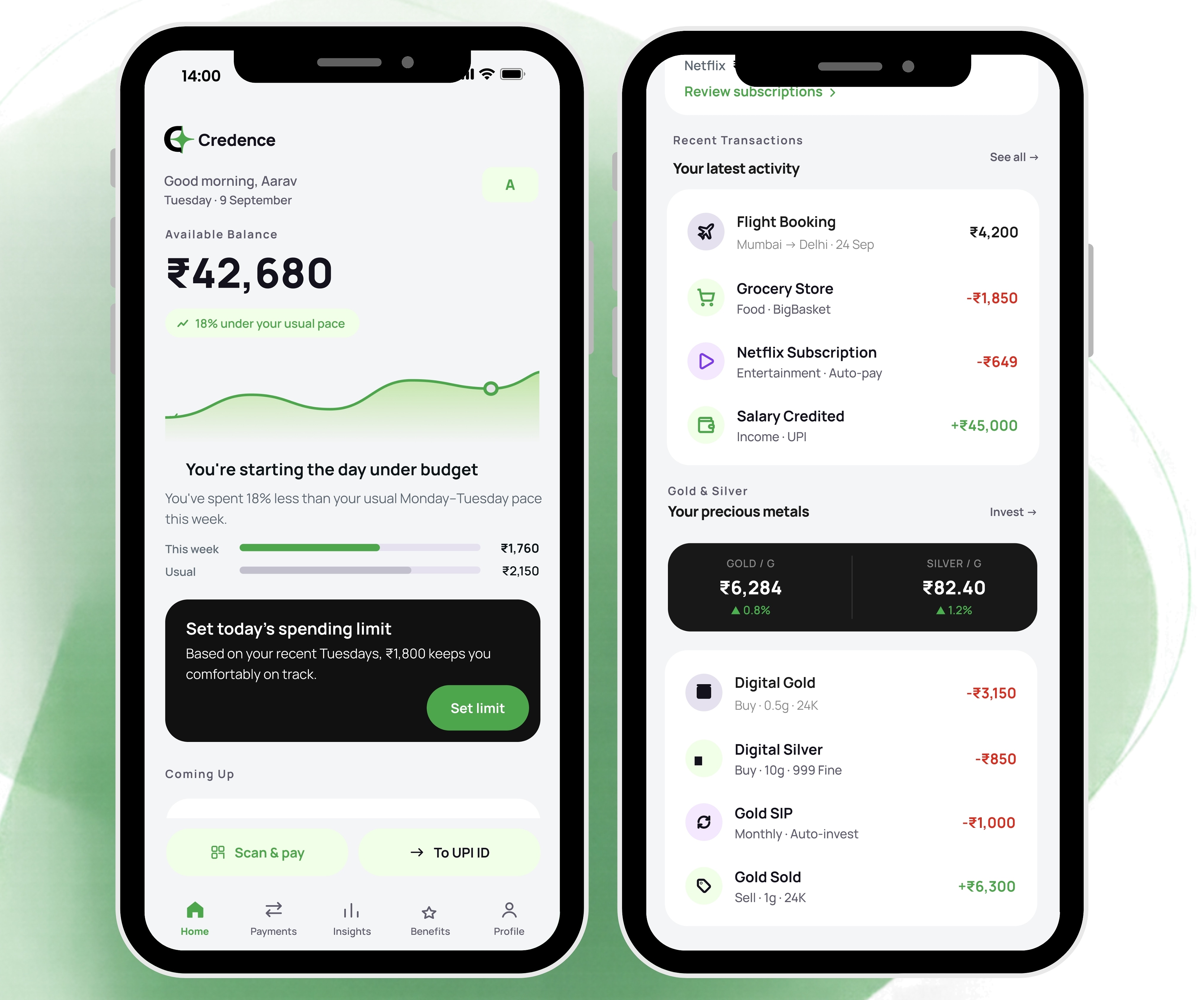
The Credence Home screen: balance, pace against the person’s usual, a suggested daily limit, upcoming charges and a Gold & Silver strip, in one scroll.

02The challenge

A money app is used in two tempos. A payment is a ten-second burst (scan, confirm, done), often one-handed at a counter. Reviewing a week is slow and reflective. One product has to serve both without making either wait for the other.

  • Numbers must be exact and meaningful. “₹1,760 spent” is exact but says nothing. Every figure needs a period, a direction and something to be compared against.
  • Money sent is hard to take back. Confirmation steps have to show who, how much and from where, and say who has verified it.
  • One surface, many jobs. UPI, bank transfers, bills, autopays, subscriptions, splits, cards and gold all live in one app. Each must stay legible without turning the product into a menu of equals.
  • Status cannot depend on colour. A completed debit, a pending bill and an incoming salary are all normal states, but they must never be confused, and green is already the brand colour.
The first screen should tell you whether today is fine, then get out of the way when you want to pay.

03The architecture

Five tabs, four ways to pay. The tab bar holds Home, Payments, Insights, Benefits and Profile, and the two most common payment actions, Scan & pay and To UPI ID, stay docked above it on every tab except Payments, where the full set is on the page.

01. HomeBalance first, then pace against “usual”, a suggested daily spending limit, upcoming charges, two “worth knowing” cards (subscriptions renewing, food running above usual), recent transactions, and a Gold & Silver strip with ₹/g prices and buy, sell and SIP rows.
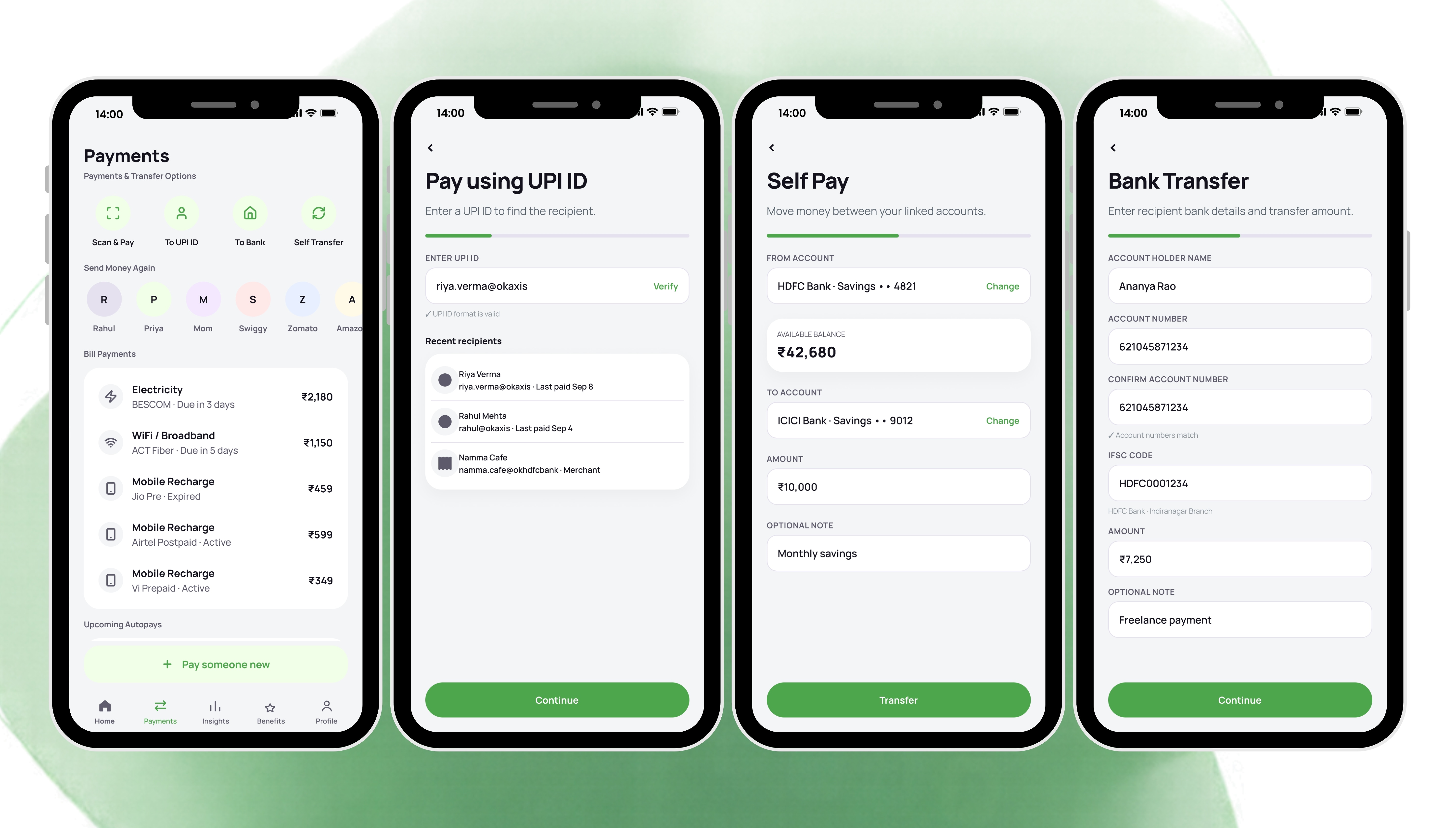
02. PaymentsFour routes (Scan & Pay, To UPI ID, To Bank, Self Transfer), “Send money again” contacts, bill payments for electricity, broadband and mobile recharge, upcoming autopays, and Pay someone new.
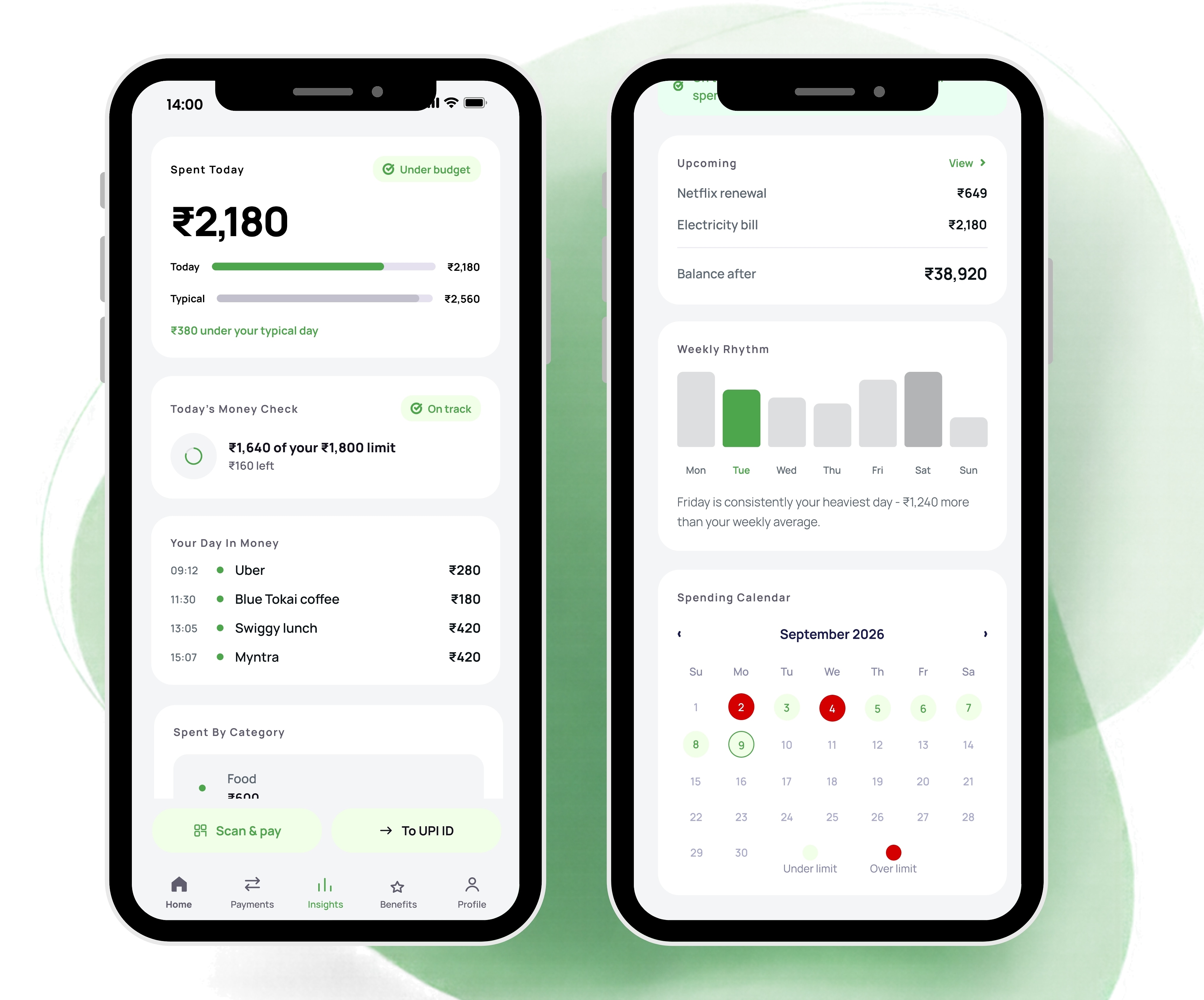
03. InsightsToday against a typical day, a money check against the daily limit, the day as a timeline, spending by category, splits and dues, a one-line plain-language summary, upcoming charges with balance after, weekly rhythm and a spending calendar.
04. BenefitsCard controls (freeze, international payments, online transactions, card details), credit, savings and primary accounts, cashback offers, active subscriptions and Refer & Earn.
05. ProfileAccount details, linked banks and UPI IDs, KYC status, notifications, privacy and security, app lock, language, dark mode and support.
Deep flowsReached from the tabs: an all-transactions list with search, Today / This Week / This Month filters, day grouping and “2× usual” flags; a food-spending drill-down; subscriptions; an investments dashboard; upcoming payments; and the bill-split flow.
Insights: today against a typical day, spending by category, dues owed to you and a calendar of under- and over-limit days.

04Key flows

Pay: four routes, one grammar

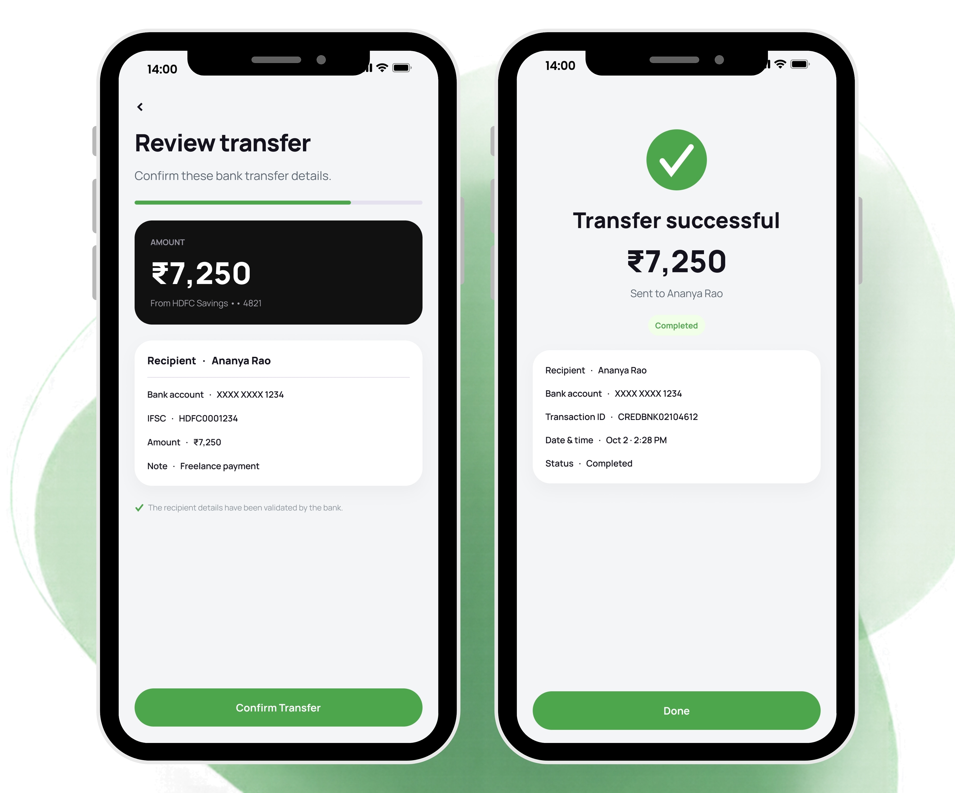
Scan & Pay, UPI ID, bank transfer and self transfer are different tasks, but they share one visual grammar: the amount in large type, a near-black summary card, a verified recipient, and a receipt-style confirmation that shows the account debited, the transaction ID, the UPI reference and the status. The UPI amount screen adds quick-amount chips (₹100, ₹250, ₹500, ₹900), an optional note and a custom keypad whose button repeats the amount it will send. The bank transfer adds a review step that states the recipient details have been validated by the bank.

Payments: four routes in one row, recent recipients, bill payments and upcoming autopays.
Bank transfer review: the amount on a near-black card, the details on a white one, and the validation message beneath.

Understand: a limit you can see yourself against

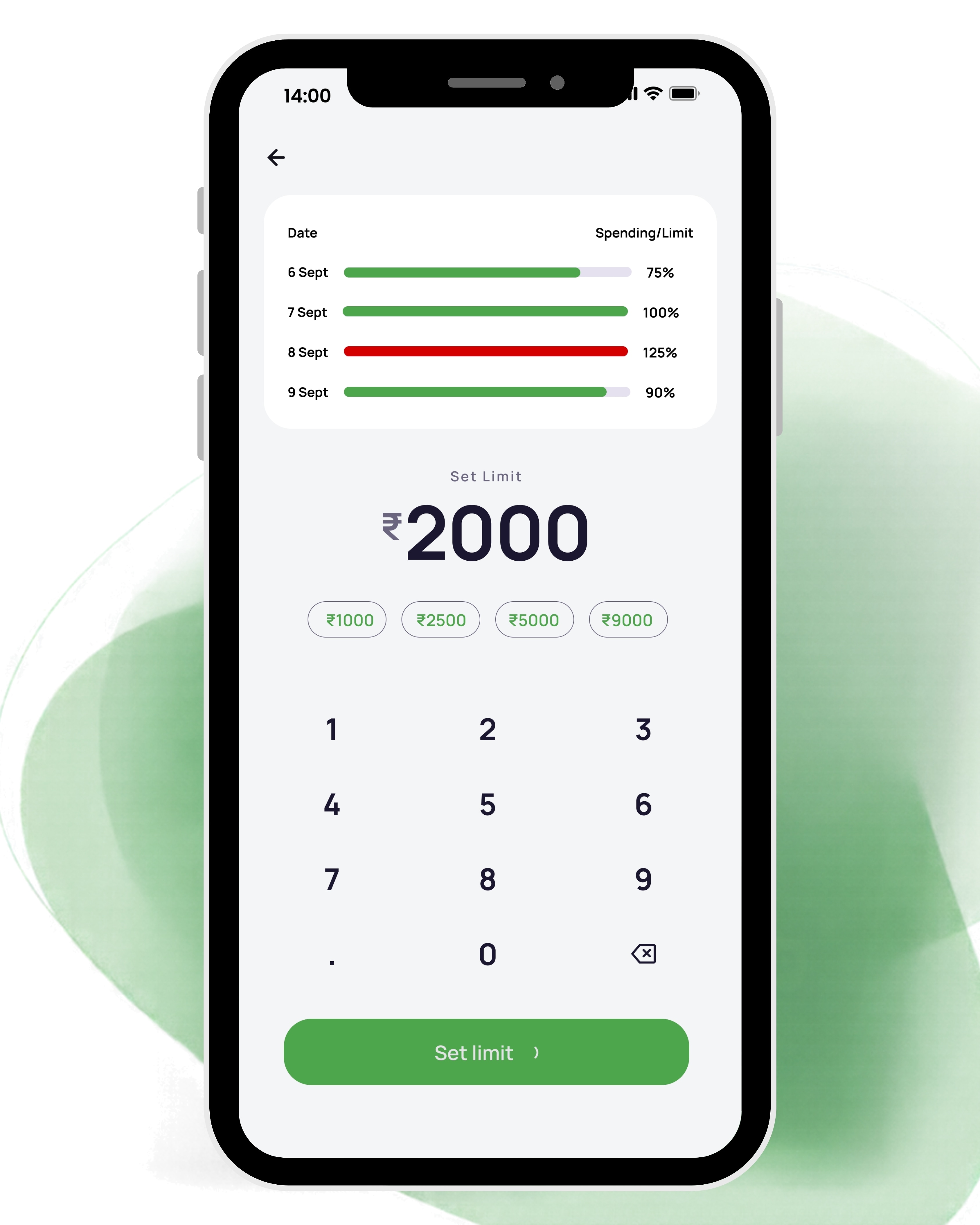
Home suggests a daily limit from the person’s recent same-weekday behaviour (“Based on your recent Tuesdays, ₹1,800 keeps you comfortably on track”). The Set limit screen shows the last four days’ spending as a share of limit above the keypad, so the number is chosen with evidence in view. Insights then tracks the day against that limit, and the spending calendar marks each day under or over.

Set limit: four days of history above the keypad, with preset amounts for a faster start.

Settle: splitting a bill

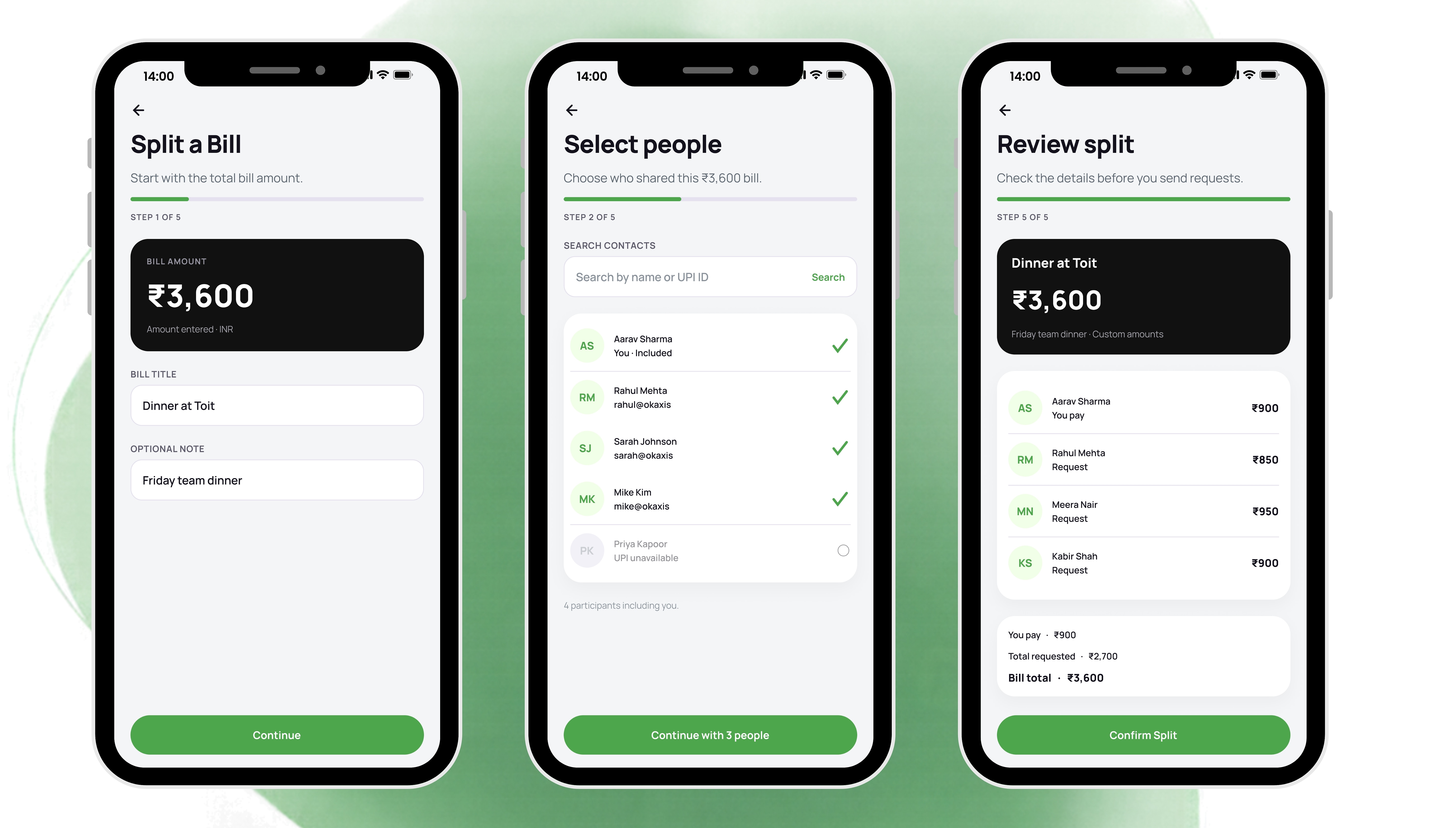
Split a Bill runs in five steps (amount, people, method, allocation, review) with a progress bar and a “Step 4 of 5” label, followed by a confirmation. On the allocation step a running panel shows what has been allocated, what remains and whether the allocation matches the bill total. From Insights, one tap on Remind starts a reminder to anyone who owes you.

Custom allocation: ₹3,600 across four people, with a live check that the split matches the bill.

05Brand and design system

Brand identity

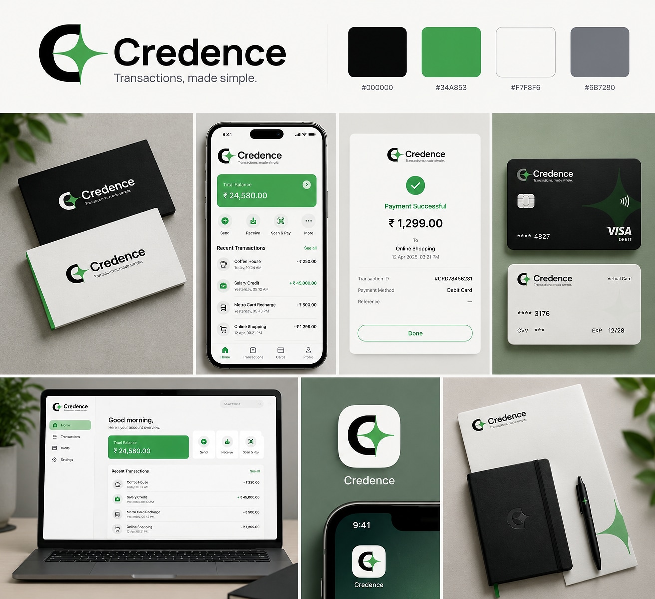
The mark is a C monogram whose open side holds a four-point spark. The spark does double duty as a recurring ornament: oversized and low-contrast on the splash screen, the card and printed collateral. The identity is three colours (green #4DA54C, black, white) and one family, Manrope. The brand board specifies pure black; the product softens it to #14121C for text and #111111 for summary cards.

Typography

One family, Manrope, from 400 to 800. Amounts are set in ExtraBold with tight tracking so they read first; labels and buttons sit at 13 px bold. The first rule in the system is that numbers lead: every amount has an explicit role, period and direction, and INR uses Indian digit grouping (₹1,24,500).

AaManrope
Manrope

Clean geometric sans-serif engineered for financial clarity. Tight tracking on Display amounts, explicit Indian digit grouping, and structured optical sizing across twenty named roles from Display Large to Navigation Label.

400 / 500 / 600 / 700 / 800tight tracking −0.02emINR digit grouping
4040 / Display
₹3030 / Display amount
Aa24 / H1
Aa20 / H2
Aa16 / H3
Aa15 / H4
Aa14 / Body
Aa13 / Body med
Aa12 / Label & btn
Aa11 / Body small

Twenty named roles in total: from Display Large down to Navigation Label.

Colour palette and semantic tokens

Colour is assigned by financial meaning, not by decoration. Sixteen of the twenty-two roles are observed in the screens; six (hover, pressed, disabled, accessible green, success text and error surface) are extrapolated and labelled as such.

Brand green#4DA54CActions, charts
Accessible green#276C2BSmall text on light surfaces, success text
Soft green#F2FFE8Soft actions, completed states
Lavender#AAAACCInvestments, quiet accent
Canvas#F4F5F6Page ground
Surface#FFFFFFTask cards
Summary black#111111Near-black summary cards
Ink#14121CPrimary text
Slate#5C5A6BMetadata
Border#E5E1EFFields, chart tracks
Error#D92D20Failed, expense
Warning#A45D05Pending, owed
Information#0066FFInformation

Shape, space and elevation

  • Space: a 4 px base with ten steps. Screens use a 20 px inset, which leaves 362 px of content on a 402 px viewport, and paired half-cards are 175 px with a 12 px gap.
  • Radius: 22 px for major cards, 14 px for fields, 8 px for icon wells and tags, 4 px for chart tracks, full rounding for buttons and avatars.
  • Elevation: four levels, with the card level at 0 / 8 / 24 / 4%. Tonal separation comes before shadow.
  • Icons: 29 outline glyphs on a 1.8 px stroke, each at 16, 20, 24 and 32 px, wrapped in 44 px or larger tap targets.

How the system was built

I drew the screens first and extracted the system from them rather than the reverse. Every token carries an evidence tag: Observed if it was read off the screens, Extrapolated if I added it to cover a state the screens do not show. That lets another designer tell what is decided from what is proposed. The foundations are written (eight of the twenty-three families in the index); the component families, from buttons to usage guidelines, are scaffolded in the file but not yet written.

The Brand Identity
The Brand Identity

06UI decision records

Every key decision made during the Credence design process.

UI-01

Four payment routes, always within one tap

Context
People reach for a payment app in a hurry, at a counter or a table, and the route they need (scan, UPI ID, bank, self) changes with the moment.
Decision
Scan & Pay, To UPI ID, To Bank and Self Transfer sit in a four-icon row at the top of Payments, and Scan & pay and To UPI ID are docked above the tab bar on Home, Insights, Benefits and Profile.
Rationale
Paying is the one action that should never need navigating to. Docking removes the “which tab is payments?” step, and the labels use the words people already use for each route.
Trade-off accepted
A permanent band of every main screen is spent on pay actions, even for someone who opened the app only to look.
UI-02

Compare every number to the person’s own usual

Context
“₹1,760 spent” means nothing without a reference, and a budget the person never set is no reference at all.
Decision
Balance trend, pace and categories are framed against the person’s own baseline: “18% under your usual pace”, “₹380 under your typical day”, a “2× usual” flag on a single purchase, “Friday is consistently your heaviest day”.
Rationale
Relative framing answers “is this normal for me?” without needing a budget, and it surfaces an unusual purchase in the list itself instead of in a monthly report.
Trade-off accepted
“Usual” needs history. For a brand-new user the baseline is empty, and that state is not yet designed.
UI-03

A suggested limit, with the evidence shown before you commit

Context
Setting a spending limit usually means choosing a number from nothing.
Decision
Home proposes a limit based on recent same-weekday spending. The Set limit screen shows the last four days against their limits (75%, 100%, 125%, 90%) above the keypad, with four preset amounts.
Rationale
The person sees how past limits held up at the moment they choose a new one. Matching by weekday matters because spending differs by day: Friday is the heaviest day in the Insights data.
Trade-off accepted
Limits are daily only; weekly, monthly and category limits are not designed. An over-limit day is drawn in red, which can read as failure, so the copy has to carry the tone.
UI-04

Near-black cards for figures, white cards for tasks

Context
A finance screen mixes two kinds of content that look alike by default: figures you read and things you do.
Decision
Summary amounts (the transfer amount on review, the monthly food total, the metals ticker, the limit prompt) sit on near-black cards. Tasks, lists and forms sit on white cards over a light canvas. Green is reserved for action.
Rationale
The eye finds the number first on every screen. The dark block is where to look, and it makes a review screen feel like a record rather than another form.
Trade-off accepted
Dark cards are the heaviest element on a light screen, so the effect dilutes quickly; Home already carries two.
UI-05

Green means “do”, not “good”

Context
In finance apps green usually means both brand and positive outcome, so a green button and a green gain compete, and a completed outgoing payment has no good colour at all.
Decision
Brand green is used for actions and charts only. Success text uses a darker accessible green. Income carries a “+” and a word. Pending is amber with a clock and the word. Failed is red with an error icon and the word, and is excluded from completed totals. Investments use the lavender accent so green and red only ever describe returns.
Rationale
Status is never carried by colour alone, which protects colour-blind users and anyone reading under glare, and each financial state has one distinct encoding.
Trade-off accepted
More encodings to learn and more tokens to maintain than a simple red and green pair.
UI-06

Fix the label, not the logo

Context
The brand green #4DA54C comes from the identity work, and white text on it measures about 3.1:1, below the 4.5:1 needed for normal-sized labels.
Decision
Keep the green as the fill. The system specifies a dark ink label on it (about 6.0:1) and the darker #276C2B for small text on light surfaces.
Rationale
Changing the green would have broken the identity. Changing what sits on it fixes the accessibility without touching the brand.
Trade-off accepted
The correction exists in the system but has not yet been applied to the screens, which still use white labels on green buttons. Until it is, the screens are the part that fails.
UI-07

Split a bill in five short steps with a running total

Context
Splitting a bill is arithmetic under social pressure, and a wrong split means an awkward follow-up.
Decision
Amount, people, method, allocation, review: one decision per screen, with a progress bar and, on allocation, a live panel showing allocated, remaining and whether the total matches the bill.
Rationale
The app does the arithmetic, and the person can see that the split adds up before they review it.
Trade-off accepted
Five steps is long for an even split of a small bill. A shortcut for equal splits is not designed.
UI-08

Remind from where you notice the debt

Context
People notice who owes them while looking at their day, not while looking at a dues screen.
Decision
Splits and Dues sits inside Insights, with a Remind button beside each person (“Rahul owes you ₹210”), leading to a reminder set-up and a “Reminder sent” confirmation.
Rationale
Chasing money is awkward, and every extra step is an excuse to put it off.
Trade-off accepted
Insights is a screen for reading, and adding actions to it blurs read and do. One-tap nudges also risk being sent more casually than intended.

07Outcome & impact

The concept gives a money-first answer to a payment app’s two tempos, and documents the reasoning behind it.

61
mobile frames, from splash screen to profile
04
payment routes (scan, UPI ID, bank, self)
08
design-system foundations documented
  • Put the answer to “am I okay today?” on the first screen: balance, pace against usual and a suggested daily limit in one view.
  • Gave every payment route the same grammar: amount in large type, near-black summary, verified recipient, receipt-style confirmation.
  • Documented the foundations with evidence tags and an accessibility audit that caught the brand green’s own contrast problem.

Still open

Two things are known and unsolved: the label contrast on green has been fixed in the system but not yet in the screens, and the component layer of the design system is not written. Both are in “what I would do next”.

Scope and attribution: this is a self-initiated concept project. I designed the brand identity, flows, high-fidelity UI and design-system foundations on my own. Names, balances and transactions are illustrative; nothing here has been built, shipped or tested with users, so the figures describe the design as specified, not measured outcomes.

08What I would do next

  • Test the premise: five-second tests of Home (“is today fine?”) and a timed pay-a-friend task, with people outside design.
  • Design the new-user state. “Usual” has no baseline in week one, and the whole framing depends on it.
  • Apply the system’s documented corrections to the screens: an accessible label colour on green, and the 11 px navigation label in place of the 9.5 px in the source.
  • Write the component layer of the design system: buttons, inputs, cards, transaction and payment components, feedback and states, empty states and usage guidelines.
  • Draw the in-between states real payments have (UPI PIN entry, processing, pending, bank declines). The flows currently go from review straight to success.
  • Design the dark theme that Profile already offers a toggle for.