all work
05Minerva
case study · social media · campaign · print · merchandise

Minerva
Literary
Society

A dozen events a year, each with its own world — and a feed that still reads as one society.

Problem
A dozen campus events needed distinct visual identities without fragmenting the society’s recognition in a crowded feed.
My role
Vice-President & lead designer — three-tile grid system, campaign art direction, print templates & merch; copy with student committee.
Timeline
Aug 2024 – May 2025 · 36 weeks
Outcome
Established a locked type hierarchy with open palette that survived across rotating volunteer student designers.
Status
Live on Instagram ↗ & campus print

01Context

Minerva is a literary society. It runs debates, quizzes, open mics, house competitions, recruitment drives, cultural days and an annual recap — and it lives, almost entirely, on Instagram.

Societies like this have a specific design problem. Every event genuinely deserves its own world: an arcade night should not look like a poetry evening, and a traditional-dress day should not look like a house tournament. But a feed where every post invents itself from scratch stops reading as one organisation, and the society loses the thing it most needs — recognisability in a crowded campus feed.

This case study merges two bodies of work that were always one system: the social media visual system and the printed and physical output — standees, event collateral and merchandise — that had to carry the same identity off-screen.

02The challenge

  • One society, many personalities. A dozen event types a year, each with a legitimate claim to its own visual world.
  • Recognition at thumbnail scale. On a phone, a post is roughly 120 px wide in the feed and about 40 px in the profile grid. Whatever makes it Minerva has to survive that.
  • Volunteer production. Posts are made by students under deadline, not by a studio. Anything that depends on fine judgement will drift within a month.
  • Screen to print, and back. The same identity has to work on a phone, on a two-metre standee in a corridor, and on a garment that people choose to wear in public.
The unit of composition is not the post. It is the row of three.

That was the reframe the whole system came out of. Instagram lays a profile out three across; a society’s feed is read as a grid far more often than as a sequence. So the campaigns were designed as three-tile strips that resolve into one image across the row, and only secondarily as individual posts.

03Instagram grids

Campaigns are built as a single artwork split across three tiles. Posted in reverse order, they assemble into one continuous band on the profile — and each tile still has to stand alone in the feed, where it will be seen without its neighbours.

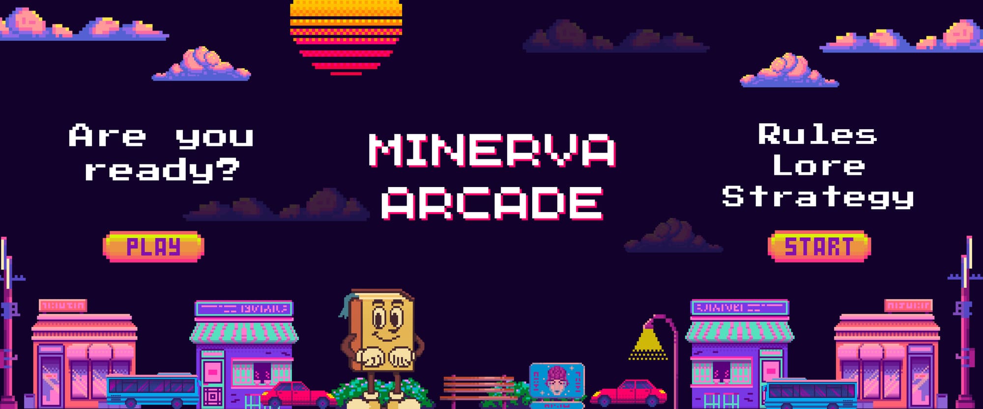
Minerva Arcade — pixel-art three-tile grid. “Are you ready? / Minerva Arcade / Rules · Lore · Strategy”, with the centre tile carrying the mark and the flanking tiles carrying the call and the mechanics.
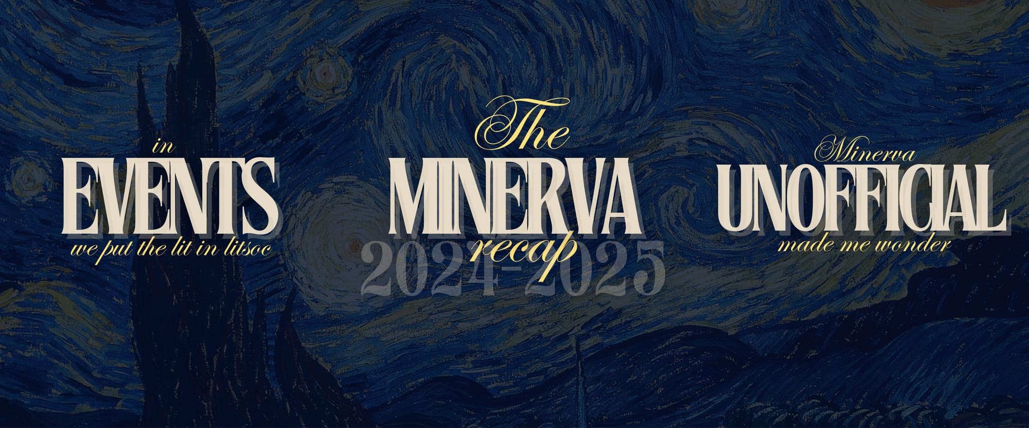
The Minerva Recap 2024–2025 — a three-tile grid on a painted night-sky field: “Events / The Minerva Recap / Unofficial”, with the year set as the centre anchor.
Why the centre tile always carries the mark

In a three-across profile grid the centre column is the one the eye lands on first and the one that stays visible longest as the page scrolls. Putting the society name in the centre tile of every campaign means the feed re-states who it belongs to every third post, without any individual post having to be branded heavily.

04Campaign posts

Single-frame posts, where the art direction is free to change completely and the structure is not.

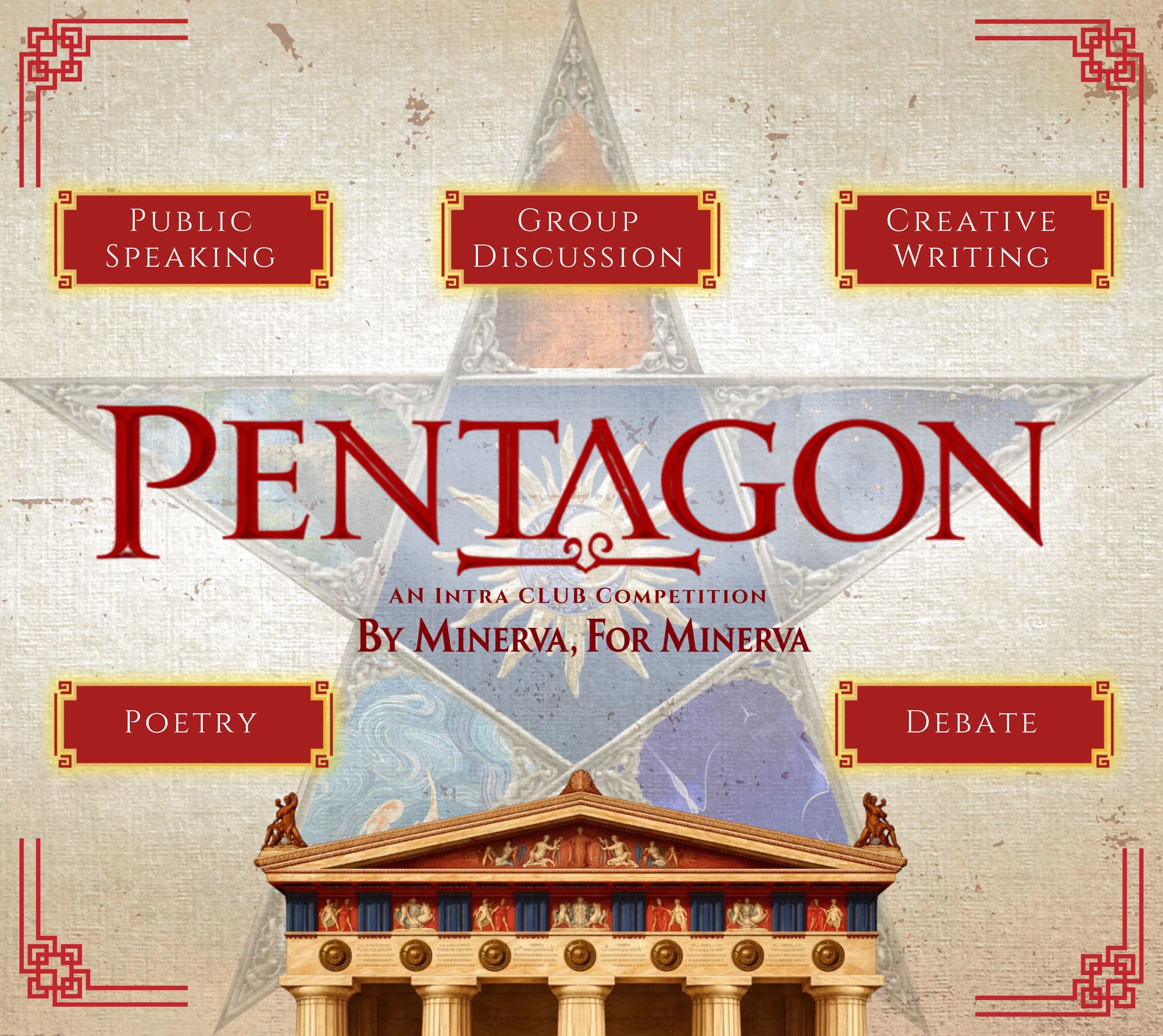
Pentagon — the society’s five-format competition. Ornamented classical architecture, with the five formats (public speaking, group discussion, creative writing, poetry, debate) set as labelled plates around the structure.
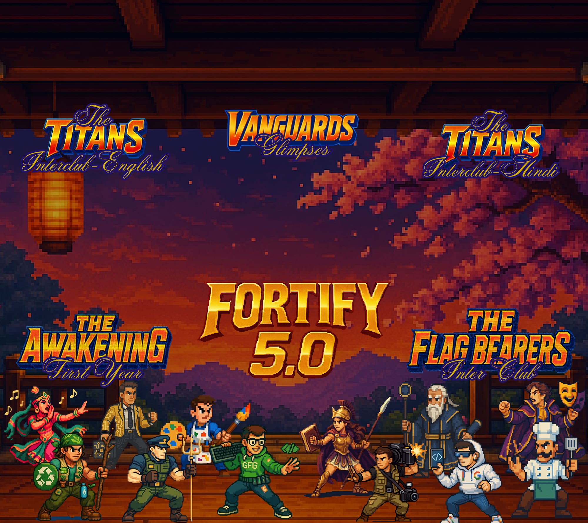
Fortify 5.0 — the society’s flagship event, rendered as a side-scrolling game screen so its five competition tracks (Interclub English, Interclub Hindi, Glimpses, First Year and Inter Club) read as factions rather than as a list of names.
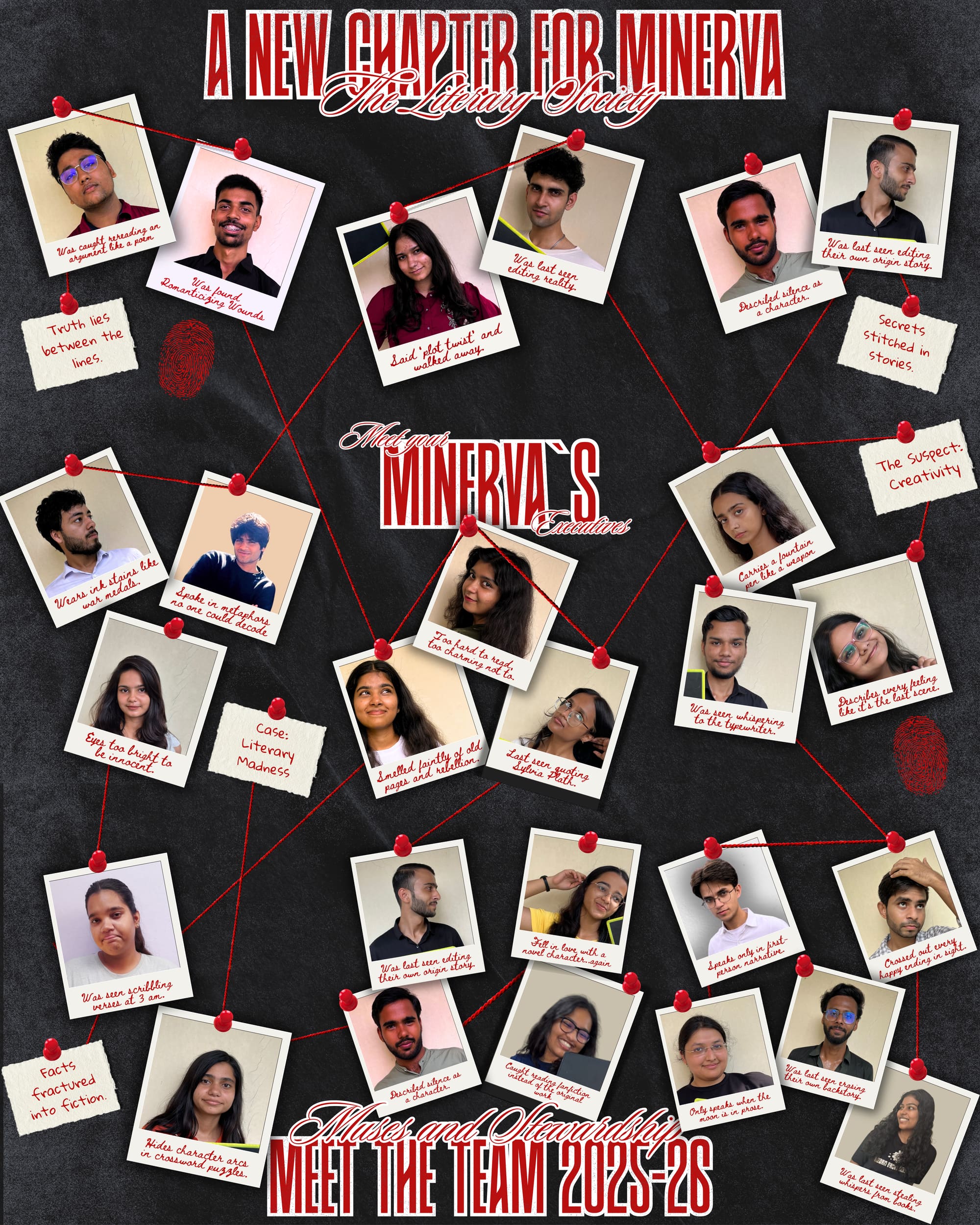
A new chapter of Minerva — the incoming session announced as a scattered polaroid wall, so twenty-odd faces can be introduced in one frame without a grid of headshots.

These three sit at opposite ends of the visual range — neoclassical, 16-bit, and handmade-photographic — and they still read as the same society. What holds them together is not colour or illustration style. It is the typographic hierarchy: an event name at maximum scale, a category line above it in tracked small caps, and supporting detail set small and centred. That skeleton is identical in all three.

05Printing and physical

The same system, taken off-screen. Print is where a social identity usually falls apart, because the constraints invert: no backlight, no crop, fixed size, and a viewer who is walking past rather than scrolling.

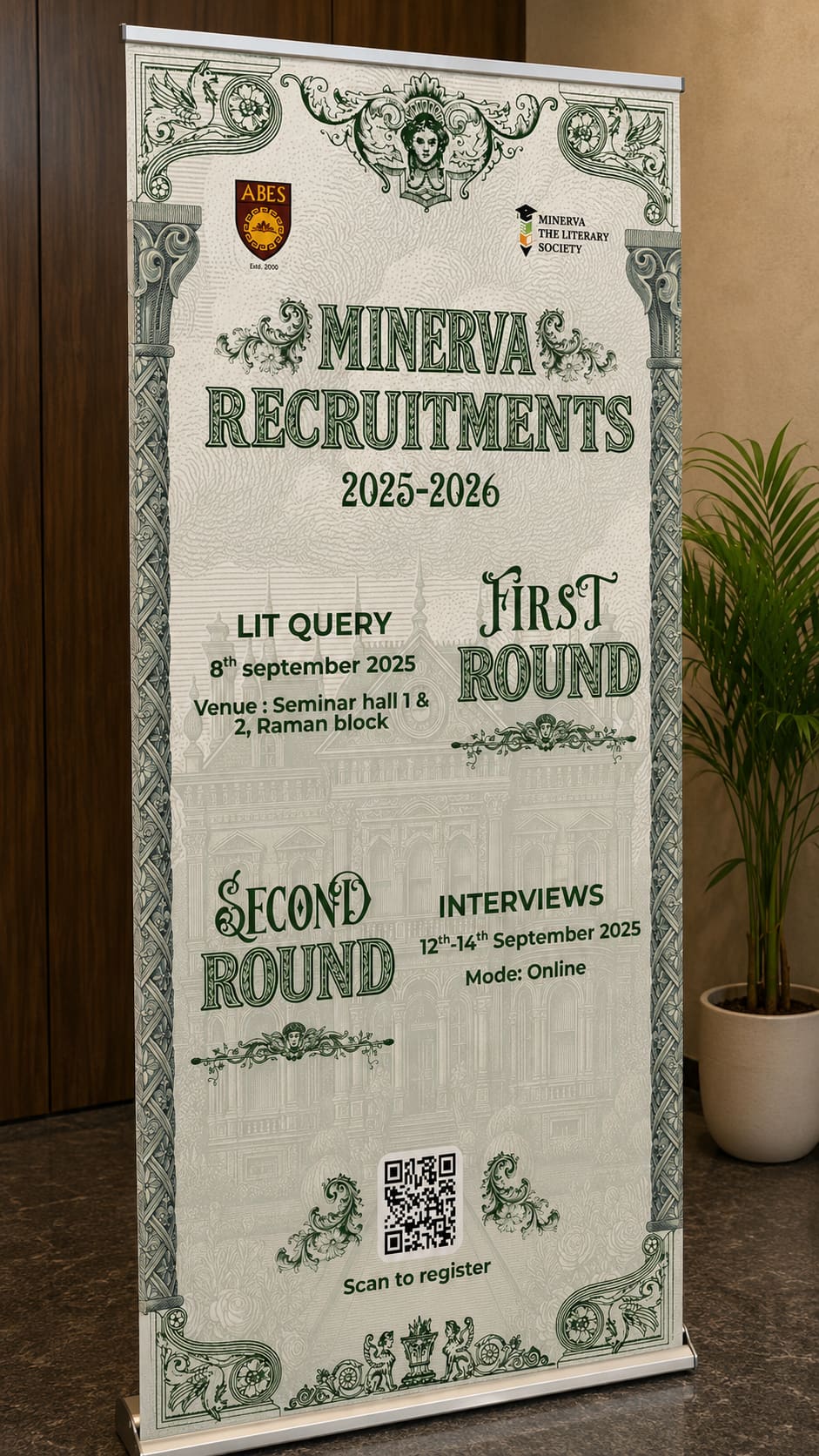
Recruitment standee, photographed in place. A two-round process printed at roughly two metres, designed to be read at a glance from a corridor.

The standee uses one vertical template with fixed safe areas for the mark, the event name, the detail block and the date. This is what lets a volunteer produce compliant print collateral in an afternoon — the decisions that are hard to get right are already made.

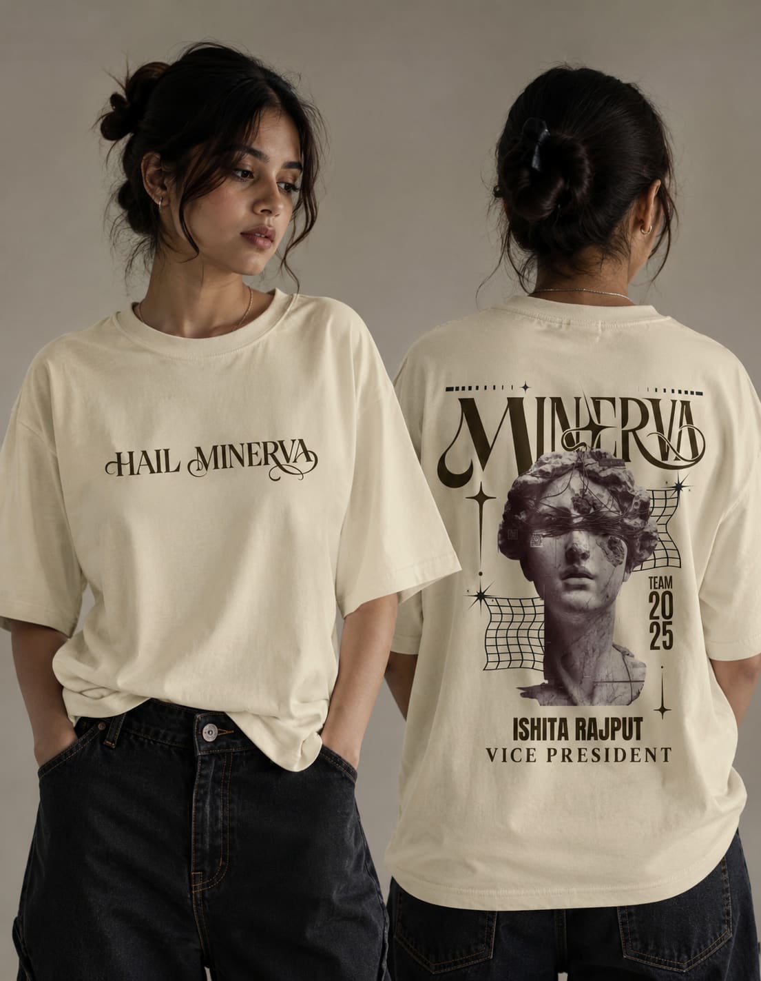
Minerva merchandise — the identity translated to a garment, worn. A bust illustration on one shirt, a wordmark lockup on the other.
The merchandise test

A t-shirt is the hardest surface an identity has to survive, because it is the only one a person chooses to display. Nobody wears a logo out of loyalty to a layout grid. The design had to work as a graphic somebody would want on their chest first, and as branding second — which is why the bust illustration carries the shirt and the wordmark stays small.

06The visual system

What is fixed

  • Typographic hierarchy. Category line in tracked small caps, event name at maximum available scale, supporting detail small and centred. Identical across every post, standee and campaign regardless of art direction.
  • The three-tile grid unit. Campaigns are composed across the row; single posts are composed within one square.
  • Centre-tile branding. The society mark lands in the middle tile of every grid campaign.
  • Standee template. One vertical layout with fixed safe areas, reused for every printed event.
  • Ornament as border, not as fill. Decorative framing lives at the edges of the composition so the centre stays available for type.

What is free

  • Palette. Each event sets its own — maroon and gold for the cultural day, magenta and cyan for the arcade night, cobalt and cream for the recap.
  • Illustration style. Pixel art, neoclassical engraving, painted texture and photography have all shipped under the same system.
  • Imagery. Photographic, illustrated or rendered, chosen per event.
The governing rule

Structure is fixed; surface is free. A volunteer designer can change every colour, every texture and every illustration in the system and the feed will still read as Minerva, because the part carrying the recognition is the part they were never asked to decide.

07Art direction decision records

AD-01

Design campaigns as three-tile grids, not single posts

Context
A society profile is read as a 3-across grid far more often than as a chronological feed.
Decision
Campaign artwork is built as one continuous image split across three tiles, posted in reverse order so it assembles correctly.
Rationale
It gives the profile a composed, deliberate surface that a sequence of unrelated squares cannot, and it triples the impact of one piece of artwork.
Trade-off accepted
The three tiles must be posted together and in order; a single post out of sequence breaks the row until the next campaign pushes it up.
AD-02

Every tile must also work alone

Context
The grid is only visible on the profile. In the feed, followers see one tile with no neighbours.
Decision
Copy is written as three self-contained clauses and each tile keeps a readable focal point, so no tile depends on the ones beside it to make sense.
Rationale
It removes the usual failure of split-image grids, where individual posts look like fragments and get scrolled past.
Trade-off accepted
Constrains the artwork — a composition whose subject spans the seam cannot be used, however good the full strip looks.
AD-03

The mark lives in the centre tile

Context
Branding every tile heavily would flatten the art direction and make the feed repetitive.
Decision
The society name and mark land in the middle tile of each grid campaign, and stay small or absent on the flanking tiles.
Rationale
The centre column of a profile grid is the most-viewed position, so the feed re-states its owner every third post while individual posts stay free to be striking.
Trade-off accepted
A single tile seen alone in the feed may carry no visible branding at all, which is a real cost accepted for the sake of the art direction.
AD-04

Fix the type hierarchy, free the palette

Context
A dozen event types a year, produced by rotating volunteers under deadline.
Decision
The category / name / detail hierarchy is locked. Colour, illustration style and imagery are entirely open.
Rationale
Recognition needs one invariant, not a rulebook. Locking the part that is hard to judge and freeing the part that is fun to make is what keeps volunteer output consistent without policing it.
Trade-off accepted
The feed has no colour consistency at all, so the society cannot be identified by palette alone the way a commercial brand can.
AD-05

Ornament at the edges, never through the middle

Context
Several events call for heavy decorative treatment — classical, festival, textile — which usually swallows the type.
Decision
Decorative framing is confined to the border of the composition; the centre stays a clear field for typography.
Rationale
It lets a design be as ornate as the occasion demands while guaranteeing the event name stays legible at thumbnail size.
Trade-off accepted
Reduces the usable canvas noticeably on the most decorative pieces.
AD-06

One standee template for every printed event

Context
Printed collateral is produced under time pressure, at cost, with no proofing round.
Decision
A single vertical template with fixed safe areas for mark, event name, detail block and date; the art direction inside is free.
Rationale
The expensive decisions — margins, hierarchy, minimum sizes, bleed — are made once. A volunteer can produce a compliant standee without understanding print.
Trade-off accepted
Every printed piece has the same silhouette, so the format itself never surprises anyone.
AD-07

Merchandise designed as a graphic first, branding second

Context
A t-shirt is the only surface a person chooses to display, and nobody wears a logo out of loyalty.
Decision
The bust illustration carries the garment at scale; the wordmark is set small and secondary.
Rationale
People wear it because the graphic is good, and the society gets carried across campus as a side effect. A shirt that is primarily a logo stays in a drawer.
Trade-off accepted
Weaker direct brand attribution — someone seeing it across a room registers the illustration before the society name.
AD-08

Photograph print work in situ, not as a flat mockup

Context
Standees and merchandise were documented for the archive and for this portfolio.
Decision
Printed pieces are photographed where they were actually used — in the corridor, on people — rather than composited into template mockups.
Rationale
A rendered mockup proves a file exists. A photograph proves the thing was made, printed, installed and worn, which is a completely different claim.
Trade-off accepted
Uncontrolled lighting and backgrounds, so the documentation is less pristine than a mockup would be.

08Outcome

  • A recognisable social-media aesthetic that still lets each post keep its own visual identity — the original brief, resolved by separating structure from surface.
  • Grid campaigns, a run of single-frame event posts, printed standees and a merchandise line, all produced from one system.
  • A layout template that lets non-designers produce compliant print collateral under deadline.
  • An identity that survives the full range it is actually used at — from a 40 px profile thumbnail to a two-metre standee to a garment.

Scope and attribution: my scope was the overall visual system, grid architecture, campaign design, standees and merchandise. Event coordination, copywriting and campaign execution were conducted with the Minerva Literary Society student committee.

09What I would do next

  • Write the system down. It currently lives in the files and in my head, which is fine while I am producing and fatal the moment the committee changes.
  • Build a grid-planning template so campaigns can be laid out against the live profile before anything is finished.
  • Extend the merchandise line beyond the tee — the bust illustration is the strongest asset the society has and it exists on exactly one product.
  • Test the ornamental pieces at true thumbnail size before publishing. The most decorative posts are the ones closest to failing at 40 px.