
all work
01TechFrien
visit live site ↗
case study · web design · ui/ux · healthtech · 2026

TechFrien

Selling hospital software without looking like hospital software.

Problem
Hospital procurement committees evaluate software on survival risk, but every vendor site in India looks identically sterile and blue.
My role
Web UX, information architecture, design system tokens, responsive UI; engineering & copy with the TechFrien team.
Timeline
Apr 2026 – Jun 2026 · 8 weeks
Outcome
Shipped a warm paper-ground marketing site exposing 12 modules above the fold with zero blue tokens.

01Context

TechFrien is a healthcare software company. Medara HMIS is its flagship product — a hospital management information system covering registration, OPD, IPD, laboratory, radiology, pharmacy, billing, insurance claims, inventory and MIS reporting on a single patient record.

This case study is about the website that sells it. The product interface is documented separately.

Hospital software is bought by a committee — a managing director, an administrator, an IT lead, sometimes a consulting physician. They are not comparing feature lists in a browser tab at midnight; they are trying to work out whether a vendor will still be answering the phone in three years. The site had to answer that before it answered anything else.

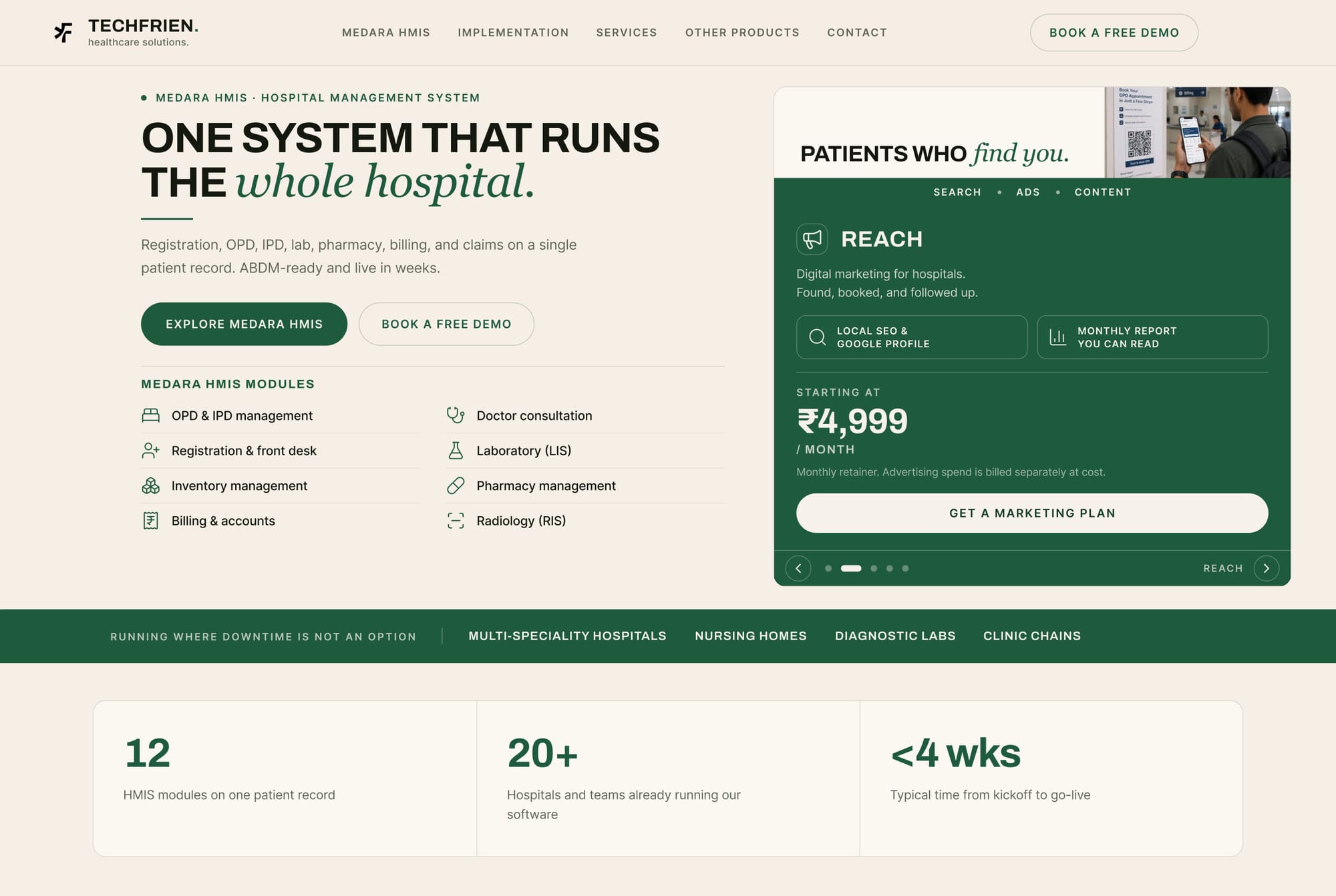
Home — warm paper ground, Archivo headline with a single Instrument Serif italic phrase, module list exposed above the fold, rotating offer card on the right.

02The challenge

Indian hospital software marketing has a house style: saturated blue, stock photography of a smiling doctor, a feature grid, "Request a demo". It is instantly forgettable and it makes every vendor look like every other vendor.

  • Differentiate without losing credibility. Looking different is easy; looking different and safe for a hospital to buy is the actual problem.
  • Twelve modules, one page. Completeness is the product's main claim, so the page has to prove breadth without becoming a specification sheet.
  • A regulatory story that most buyers only half-understand. ABDM compliance is decisive in the Indian market, and it needs explaining without a wall of acronyms.
  • Two different buyers. One wants the packaged product; one wants something custom-built. The same page has to serve both without splitting in half.
The category signals trust with blue. I signalled it with restraint and warmth instead — thirteen colour tokens and not one of them blue.

03Information architecture

A single deep home page carrying the whole argument in sequence, with five supporting destinations for people who arrive already interested.

HeroProposition, module names, contact details and the offer card — everything a disqualifying question needs, above the fold.
Trust bandInverted green strip: running where downtime is not an option, plus the four hospital segments served.
Proof stripThree counts — 12 modules on one patient record, 20+ hospitals and teams live, under 4 weeks typical kickoff to go-live.
The caseLong-form explanation with a drop cap, and four operational figures published by TechFrien.
In useA photograph of Medara running on a ward floor rather than a rendered device mockup.
ModulesTwelve modules in a bordered grid — registration, OPD, IPD/wards & OT, laboratory, radiology, pharmacy, billing, insurance & TPA, inventory, HR & payroll, MIS dashboards, patient & doctor apps.
Built for / SafeguardsTwo paired panels — hospital types on the left, standards and safeguards as chips on the right.
FAQEight questions written as procurement objections, not marketing prompts.
ABDMA full inverted deep-green section on Ayushman Bharat Digital Mission compliance.
Sub-pagesImplementation · Services · Other products · Contact · Book a demo.

04The design system

Typography

Three faces, each with one job, and a strict rule about the third.

AaArchivo
Archivo

Display. All-caps, tightly tracked, used for every section headline. A grotesque with slightly condensed proportions, so a long headline still fits on two lines at large size — which matters because these headlines are full sentences, not labels.

700uppercasetracking −0.02em
AaInter
Inter

Text. Body copy, module names, FAQ answers, form labels, footer. Neutral by design — the display face and the italic accent carry all the personality, so the reading face should carry none.

400 / 500 / 60016px / 1.65measure ≤ 68ch
AaInstrument Serif
Instrument Serif

The accent. A high-contrast italic serif used for exactly one phrase inside a headline — “runs the whole hospital”, “around you”, “Ayushman Bharat Digital Mission”. It is the only decorative move in the entire system, which is precisely why it works.

italic onlyone phrase per headlinenever body
Aa52 / hero
Aa34 / section
Aa20 / lede
Aa16 / body
Aa14 / ui
Aa12 / label

Colour

Thirteen tokens, named by role. The system deliberately has no blue in it at all.

Paper#F6EFE6Page ground
Paper warm#FBF7F1Raised panels, hero left
Surface#EFE7DBAlternating sections
Card#FFFFFFCards on paper
Ink#14180FHeadlines, body text
Muted#5F6657Secondary text
Muted soft#7C8374Captions, meta
Green#1E5B3DPrimary action, brand
Green deep#143D28Inverted sections
Green mid#2B7350Hover, secondary fills
Green soft#E8EFE5Tints, highlight rows
Green tint#DDE8DASubtle fills
On green#F7F2E9Text on inverted panels

Line and shadow are tokens too: borders are rgba(20,24,15,.14) and rgba(20,24,15,.07) — the ink colour at low alpha rather than a separate grey, so rules always sit in the same family as the text. Elevation is a three-step scale (sm, md, lg) built from ink at 3–4% alpha, which keeps shadows warm instead of grey.

The full page in sequence — hero, trust band, proof strip, the case, product in use, twelve-module grid, built-for and safeguards, FAQ, CTA band, ABDM section.

05UI decision records

The decisions that make this page different from the category, and what each one cost.

UI-01

A warm paper ground instead of clinical white

Context
Health-tech defaults to white or pale blue, which reads as sterile and makes every vendor look identical.
Decision
The page ground is #F6EFE6 — a warm, slightly pink-cream — with a second warmer tone for raised panels.
Rationale
It differentiates instantly in a category that all looks the same, reduces glare on a very long page, and lets the deep green read as considered rather than corporate. Warmth also does quiet work for a product used in hospitals, where the environment is already cold.
Trade-off accepted
Every contrast pair had to be re-checked against a non-white ground, and pure white cards now need a border to separate from the paper rather than relying on colour difference alone.
UI-02

One italic serif phrase per headline

Context
The headlines are full sentences and needed emphasis without adding a colour or a second weight.
Decision
A high-contrast italic serif carries exactly one phrase inside an otherwise all-caps grotesque headline.
Rationale
It creates a focal point inside a sentence, gives the brand a recognisable signature, and costs nothing in the colour system. Because the rule is one phrase, the device stays sharp.
Trade-off accepted
A third webfont to load, and a rule that has to be enforced in every future headline — the moment it appears twice in one sentence it stops being emphasis and becomes decoration.
UI-03

Module names in the hero, above the fold

Context
The first question a hospital asks is not "what is this", it is "does it do radiology".
Decision
Eight module names with icons sit directly under the hero CTAs, in two columns with hairline dividers.
Rationale
It answers the disqualifying question immediately. A visitor who needs a module that is not listed can leave in five seconds, which protects the rest of the funnel from unqualified enquiries.
Trade-off accepted
It makes the hero unusually tall and dense, and pushes the trust band below the fold on shorter laptops.
UI-04

Contact details in the hero

Context
Hospital procurement in this market moves by phone, not by form.
Decision
Phone number and email are printed in the hero itself, alongside the module list.
Rationale
It removes an entire navigation step for the highest-intent visitor and signals that a real organisation with a real phone line is behind the product.
Trade-off accepted
Loses the ability to attribute those enquiries to a page or campaign.
UI-05

A rotating offer card instead of a pricing page

Context
Two buyers — one wants packaged Medara, one wants a custom build — and pricing that genuinely depends on scope.
Decision
A carousel card in the hero cycles through the offers, each with its own pricing posture; the custom slot states On request — quoted per scope with the line "fixed scope and a fixed number, agreed before a line of code is written".
Rationale
One slot serves several propositions without a pricing page that would have to hedge. Naming the pricing posture honestly is itself a trust signal in a category full of "contact us".
Trade-off accepted
Carousels hide content. Anything past the first slot is seen by a minority of visitors, so the first slot has to be able to stand alone.
UI-06

An inverted green trust band immediately after the hero

Context
The page needed a hard visual break and a qualification statement in the same move.
Decision
A full-width deep-green strip: running where downtime is not an option, followed by the four hospital segments served.
Rationale
The inversion acts as a chapter break after a dense hero, and the segment list lets a visitor confirm they are the intended buyer before investing in the rest of the page.
Trade-off accepted
Inverted bands are expensive vertically, and the text on them needs its own colour token (#F7F2E9) rather than plain white.
UI-07

Twelve modules as a bordered grid, not cards

Context
Breadth is the product claim, so the section has to feel complete rather than curated.
Decision
A three-by-four grid of bordered cells, each with an icon, a module name and two lines of scope.
Rationale
A continuous ruled grid reads as a system; separated cards with shadows read as a selection of highlights. Here the message is "all of it, in one place", and the grid says that structurally.
Trade-off accepted
Twelve equally weighted cells give no room to emphasise the modules that actually differentiate the product.
UI-08

ABDM given a full inverted section

Context
Ayushman Bharat Digital Mission readiness is the strongest regulatory differentiator in the Indian market, and it is usually buried in a compliance footnote.
Decision
A dedicated deep-green section with six explainer cards — ABHA creation and linking, HFR and HPR onboarding, consent-driven sharing, standards-based records, audited and reversible, data stays in India.
Rationale
It converts an acronym into six plain-language guarantees, and the inversion gives it the visual weight of a headline claim rather than a compliance note.
Trade-off accepted
Six cards of dense regulatory copy near the end of an already long page — it needs the inversion to earn attention, and it will not be read by casual visitors.
UI-09

An FAQ written as procurement objections

Context
The real blockers are commercial and operational, not feature-related.
Decision
Eight questions in the buyer’s own words — can we run Medara on our own servers?, will our old patient data come across?, what happens if something breaks at 2am?, do you charge per user?
Rationale
Answering the uncomfortable questions plainly does more for trust than another feature block, and the natural phrasing makes the section directly quotable by search and AI answer engines.
Trade-off accepted
Longer, less polished copy than a marketing-voice FAQ, and it requires the business to actually commit to the answers.

06Responsive behaviour

  • The hero splits vertically — proposition, CTAs, module list, then the offer card. The card moves below the modules because on a phone the module names qualify faster than the pricing does.
  • The module list drops from two columns to one but keeps its dividers, so it still reads as a specification rather than a list of links.
  • The twelve-module grid becomes a single column with the border collapsing to a top rule per cell — the grid metaphor survives at one column because the rules stay continuous.
  • The italic serif accent scales down but never wraps. Headlines are set so the serif phrase always lands on its own line at small sizes.

07Outcome

Figures published by TechFrien for Medara HMIS deployments:

12
hmis modules on one patient record
20+
hospitals and teams live
<4 wks
typical kickoff to go-live
  • A site that is recognisably not the category default, without sacrificing the credibility signals a hospital committee needs.
  • Twelve modules communicated as one system rather than as a specification sheet.
  • A regulatory story turned into six plain-language guarantees.
  • A documented token set — thirteen colour roles, three type roles, a three-step elevation scale — that the team can extend without asking a designer.

Scope and attribution: my scope was the website UX, information architecture, design system and UI layout; engineering and copy were produced with the TechFrien team. The figures above are published by TechFrien and describe the product, not the website. Screenshots captured from the live site, August 2026.

08What I would do next

  • Test the offer carousel against a static three-up. Carousels reliably under-perform, and this one is carrying an important proposition.
  • Give Implementation its own narrative page — “live in weeks” is the strongest claim on the site and currently has the least supporting evidence.
  • Add a module-level deep link so a visitor searching for “radiology information system” lands on that module rather than the home page.
  • Build a dark mode. The warm palette has no dark counterpart, and a share of hospital IT staff work in dark interfaces all day.